


If you have ever wondered how some traders manage to spot which stocks are likely to outperform the market before it happens, you are about to discover one of their secret tools: ‘The RRG chart.’
What is an RRG chart?
RRG stands for Relative Rotation Graph. It is a powerful visual comparing multiple stocks or sectors against a benchmark index like Nifty 50, Bank Nifty, or Nifty Pharma.
Imagine you are looking at the performance of multiple banking stocks like HDFC Bank, Kotak Bank, and IndusInd Bank. The RRG chart helps you see which ones are outperforming the Bank Nifty, which are losing steam, and which may be ready to turn around.
This is not just about price movement in isolation. It is about relative strength and momentum compared to a benchmark.
The Four Quadrants of RRG
The RRG chart has four key quadrants that tell you the relative health of a stock compared to its index:
| Quadrant | What It Means | Action Signal |
|---|---|---|
| Leading | Stock is strong and gaining momentum | Hold or add positions |
| Weakening | Stock is strong but momentum is slowing | Monitor or consider booking profits |
| Lagging | Stock is weak and losing momentum | Avoid or exit |
| Improving | Stock is weak but gaining strength | Watch closely for breakout |
Stocks rotate through these quadrants in a clockwise motion over time. This is where it becomes powerful: you can anticipate movement before it is fully reflected in the price.
On 8th May 2025 GRANULES was in the lagging section of the RRG chart This meant it was not performing well compared to its sector, which in this case is the Nifty Pharma index
Now comes the interesting part by 12th May 2025 GRANULES had moved to the improving section. This shift is important because it tells us that the stock had started gaining strength even though the price might not have shown a big move yet.
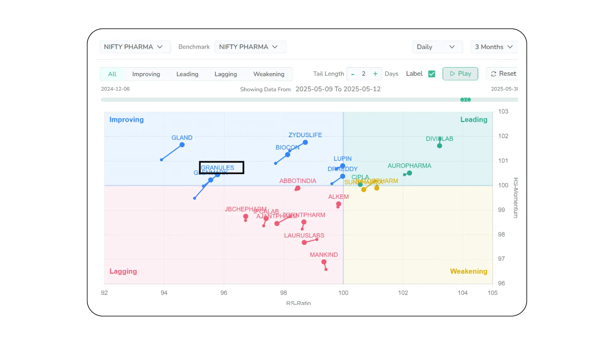
The RRG chart helped us notice this change early by showing two things
First, it showed that GRANULES was doing better than before when compared to other pharma stocks This is called improving relative strength
Second, it showed that the speed of improvement was also increasing This is a sign that the stock was gaining attention and could be preparing for a better move ahead
So while many traders might have ignored GRANULES because the price looked bearish on the chart as shown in the image below, the RRG chart gave us a quiet clue that something was changing under the surface
This is why using RRG charts can be helpful and it lets you see which stocks are starting to improve before everyone else notices.
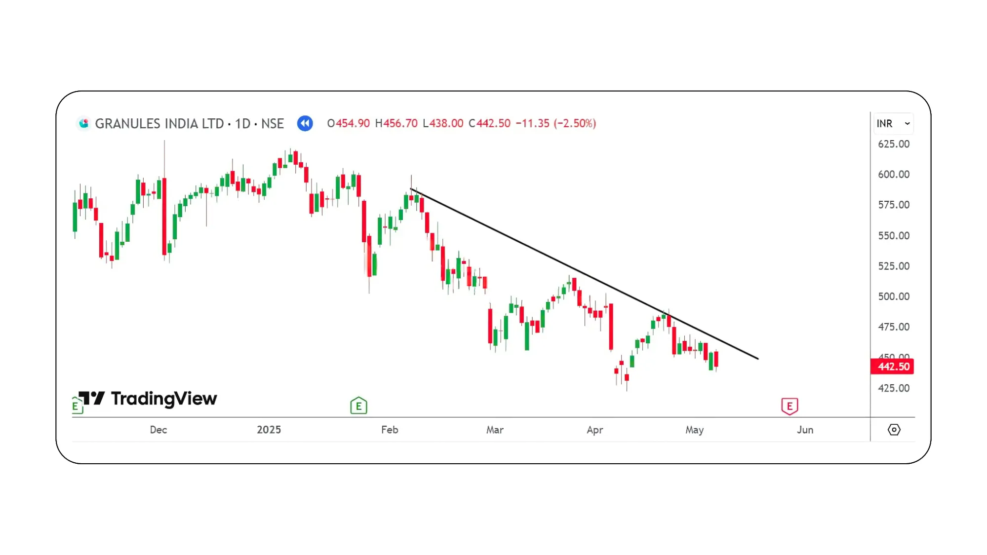
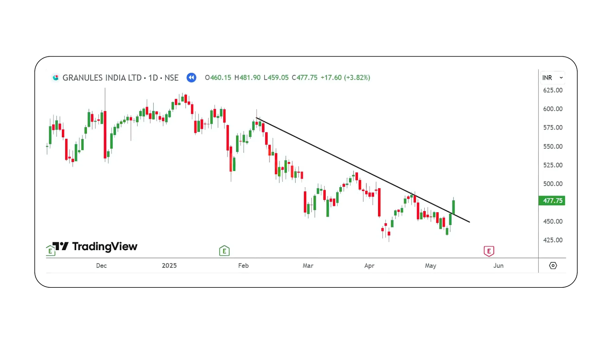
On 13 May 2025, GRANULES broke above a key trendline. The candle was strong and bullish, closing near the top. This confirmed what the RRG chart had already hinted — the stock was gaining strength and momentum. A double bottom pattern had formed, and right before the breakout, three white candles appeared, adding more signs of bullishness. All signals pointed to a possible upmove.
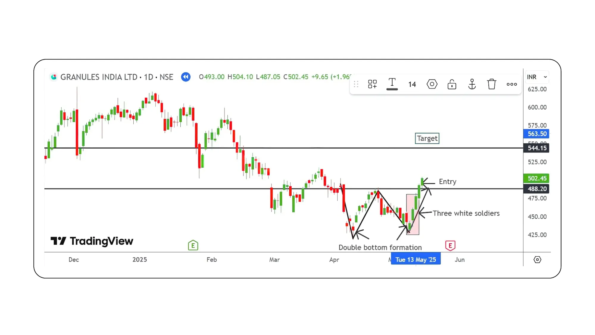
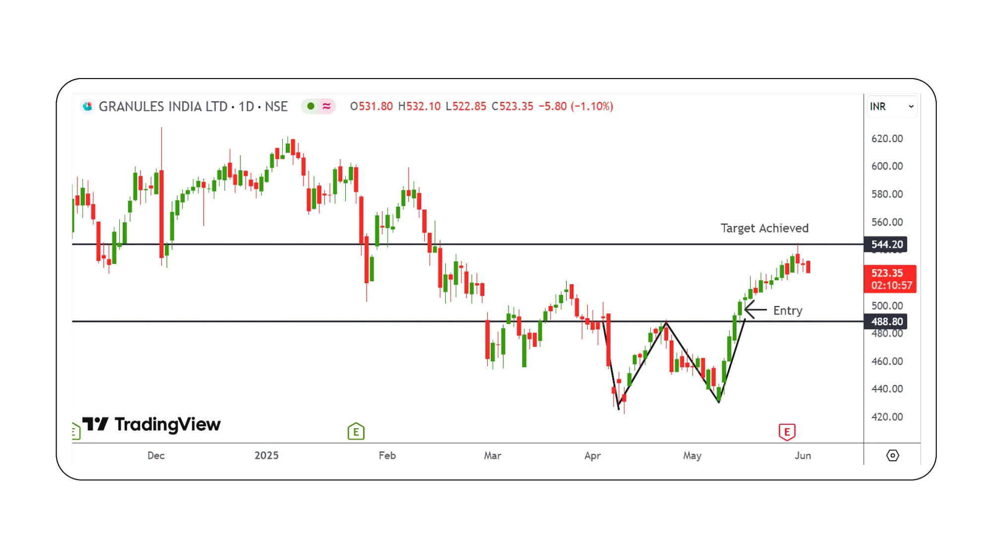
On the GRANULES daily chart, a double bottom pattern formed with a neckline around ₹493. After the breakout above ₹494 on 15th May 2025, the entry was triggered. This breakout was followed by a strong continuation with the appearance of three white soldiers, confirming bullish momentum.
The target was calculated by measuring the height of the double bottom (approximately ₹50) and adding it to the breakout point (₹498), giving a projected target near ₹544. This target was successfully achieved. The stop-loss was placed just below the pattern’s low to manage risk.
The setup was firstly supported by the RRG (Relative Rotation Graph), where GRANULES was seen moving from the improving to the leading quadrant, indicating rising relative strength. Combining price action patterns with RRG analysis helped identify the stock early and capture a profitable move.
When technical patterns meet relative strength The GRANULES trade is a textbook example of how combining classic price action patterns like the double bottom and momentum candlestick signals such as three white soldiers with RRG-based relative strength analysis can offer a significant edge in spotting breakout opportunities early. While price alone may have looked uncertain, the RRG chart hinted at a structural shift in strength well before the breakout.
This case proves that timing, when backed by data and structure, is not just luck, it is strategy.
For traders looking to stay ahead of the curve, blending traditional chart patterns with tools like the Relative Rotation Graph can uncover high-probability setups before the crowd catches on.
Disclaimer: The information provided in our blogs is for informational purposes only and should not be construed as financial, investment, or trading advice. Trading and investing in the securities market carries risk. Always conduct your own research and consult with a qualified financial advisor before making any investment decisions. Past performance is not indicative of future results. Copyrighted and original content for your trading and investing needs.
©️ 2025 — Tradejini. All Rights Reserved.