


When it comes to stock investing, it is critical for investors to understand how the market works. One of the most important concepts to learn in order to grasp this is trend analysis. But before we begin, let’s understand the concept of trendline in the stock market.
The stock market, which is now a very popular avenue among Gen Z and Millennials, requires a solid understanding of how it works when it comes to investing or trading. Trendlines are a simple and easy-to-understand tool in technical analysis that help identify trends. However, many people make mistakes while drawing them. Surprisingly, these mistakes are not only made by beginners but also by experienced traders. There is a twist here! In this video, I will explain the common mistakes made while drawing trendlines. This will help you learn and avoid these errors because, as they say, learning from mistakes is often the best teacher.
Understanding Market Bumps
Interesting, right? Just like the bumps we encounter on the road, the market experiences similar bumps on the chart. These bumps are the highs and lows, which are the trends in the market. The price either moves up or down, creating swing highs and swing lows. Have you ever seen the market moving consistently in one direction? I am sure not! The market always creates different directional price actions.
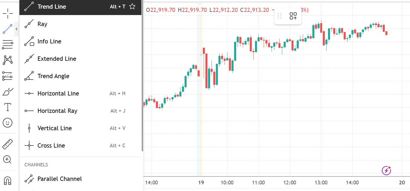
Before moving further let's explore where to find the trendline drawing tool in the charts. Head to the drawing tools section and search in lines section as depicted on the screen.
What Exactly is a Trendline?
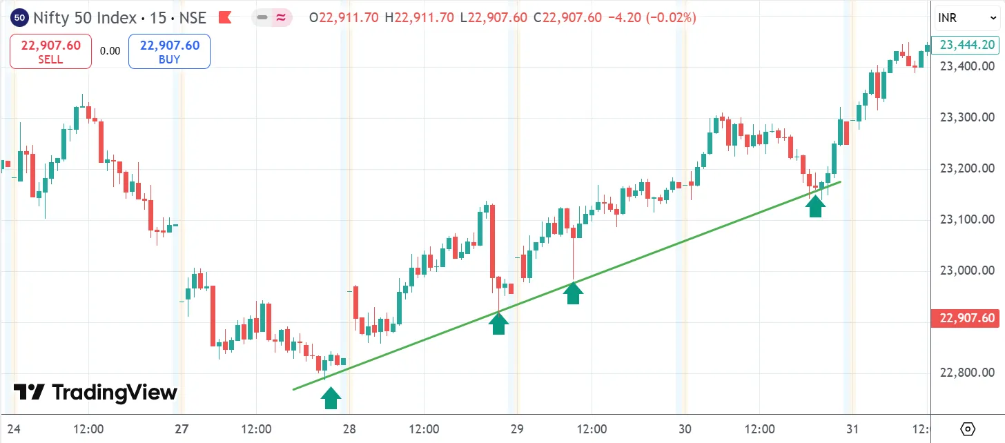
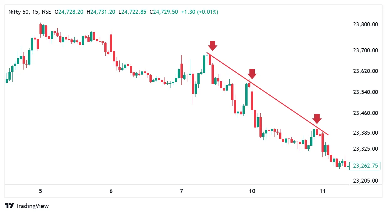
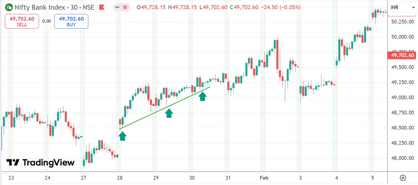
A trendline connects a series of rising bottoms with a straight line, forming an uptrend line. Similarly, when a series of lower tops are connected with a straight line, it forms a downtrend line. As you can see on the screen, I have plotted an uptrend stock where the price is creating higher tops and bottoms. When we connect these points, it forms a trendline, represented by the green line. On the other hand, the red line in the chart shows a downtrend line where the price is forming lower tops. Trendlines help determine whether a stock or index is in an upward or downward trend.
Mistake while drawing trendlines
How not to draw upward and downward trendlines
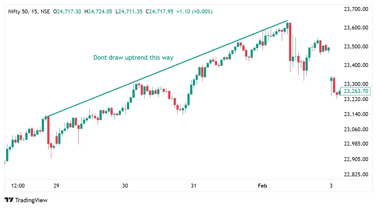
Drawing an upward trendline by connecting higher highs, as shown in the chart below, is incorrect. An upward trendline should always be drawn by connecting higher lows, which accurately indicates that the direction is moving upward.In this case either use Parallel channel so both higher point and lower points will act as support and resistance.
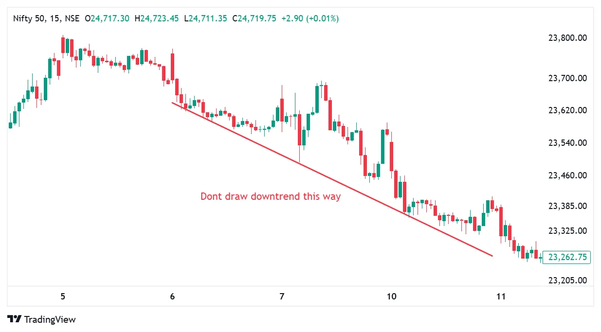
Drawing a downward trendline by connecting lower lows, as shown in the chart below, is incorrect. A downward trendline should always be drawn by connecting lower highs, which accurately indicates that the direction is moving downward. In this case, either use a parallel channel so both higher point and lower points will act as support and resistance.
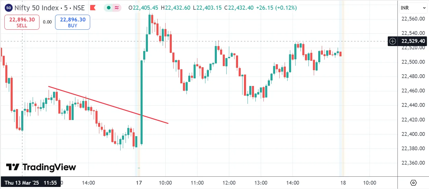
Why two points are not enough for valid trendlines
In geometry, we learned that two points are enough to draw a line. However, when drawing trendlines, two points are not sufficient. To validate a trendline, a third point is necessary. Until the stock or index price touches the trendline at a third point and respects it, the trendline cannot be considered valid. Without a third point, the trendline lacks credibility, making it unreliable.
On the below chart where only two points are touched which is not a valid trendline and also unreliable.
Confusion between wicks and bodies in trendline drawing
Correctly connecting either the wicks or the bodies of candles is crucial when drawing trendlines to identify support, resistance, or trends. Consistently using wicks helps identify potential reversals, while using candle bodies can provide a more accurate reflection of price action. Mixing them or switching between the two can lead to false signals and misinterpretations.
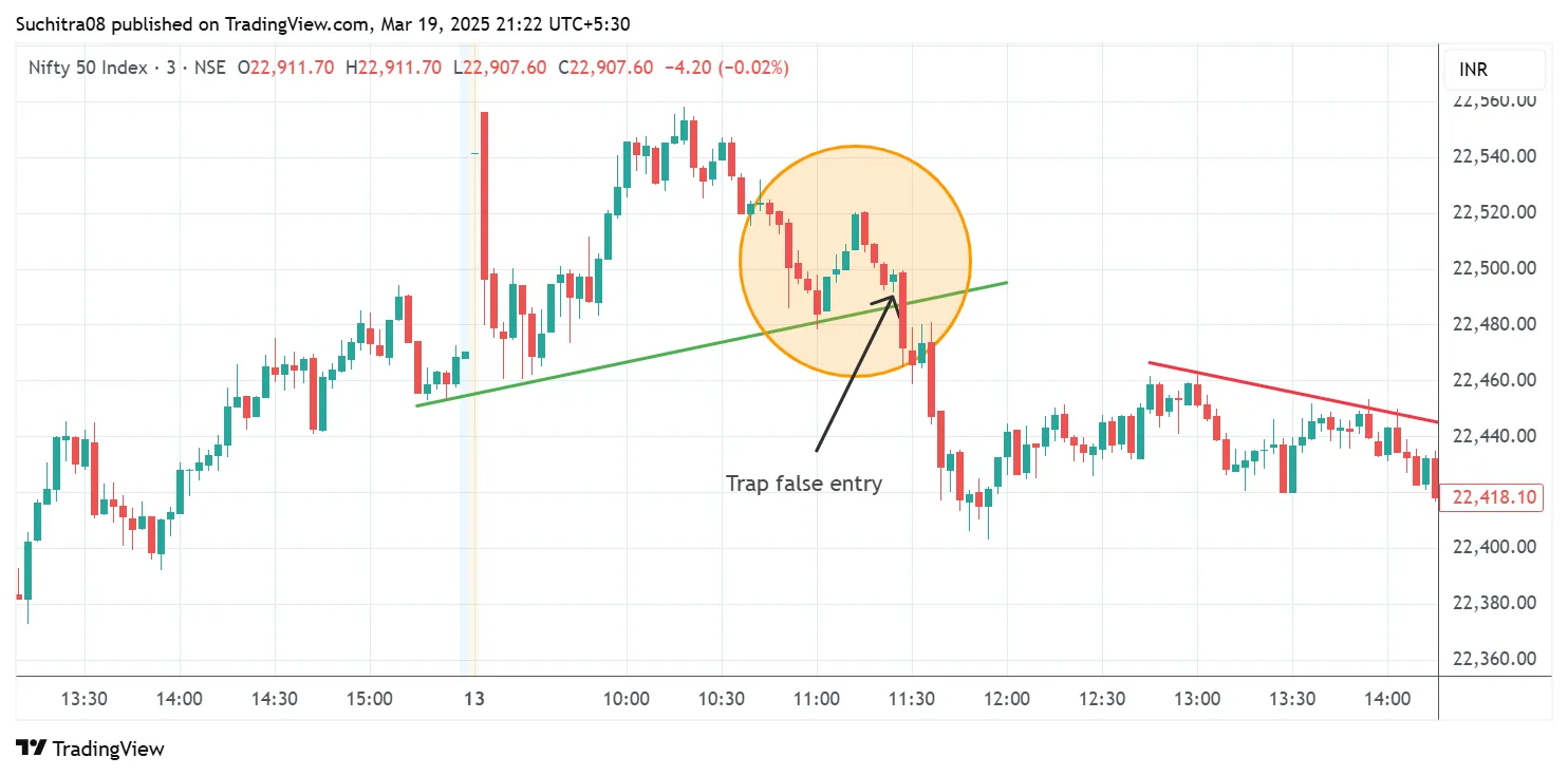
Ignoring Time frame constraint
Carefully consider the time frame when drawing and interpreting any trend lines. Where 15 min time frame for scalping can carry sustainable strength than 3 min time frame. Daily lines carry more weight than 15-minute versions. An hourly trend line break may have little effect on the prevailing daily trend channel and so on. Wrongly used time frame can lead to false entry.
We covered the basic mistakes often done when drawing trendlines what they are, the difference between uptrend and downtrend lines, the importance of having at least three touch points to validate a trendline and the importance of time frame. Hoping you would have learnt the mistakes done when drawing trendlines and now we will continue with our series of trendlines. Upcoming videos will be really useful for trading.


