


What if I told you the market actually leaves clues before every big move? I once spotted a tiny triangle on Reliance’s chart and thought it meant nothing until the stock jumped 8 per cent in just two days. That’s when I realised these shapes aren’t random. They’re hints the market gives us. When I opened my first TradingView chart, everything looked messy and confusing. But once I learned chart patterns, the same chart started telling a clear story about where buyers are active, where sellers are nervous, and where the price could move next. If the market were a book, chart patterns would be its hidden language. Most people only notice red and green candles, but traders who understand patterns are actually reading market psychology in real time.
What are Chart Patterns?
Chart patterns are repeated shapes we see on price charts. They form based on how the price moves over time. Traders use these patterns to guess where the price might go next, whether a trend will continue or change, and to gauge market mood. In simple words, they work like a guide for when to enter or exit a trade using Technical analysis chart patterns.
What are Chart Types?
When I started trading, I thought every chart looked the same. Most new traders don’t realise it, but the chart type you use can completely change how you understand the market. Each trading day has four important prices: where it opened, the highest point, the lowest point, and where it closed. These are called Open High Low Close OHLC prices. If we look at many days, that becomes a lot of information. Normal charts, like bar or pie charts, can’t show all four prices together, so they are not useful for trading analysis. Traders need special charts that show all four prices at once, like candlestick charts, which make it easier to understand what really happened in the market.
Below are some of the chart types:
Line chart
Bar Chart
Japanese Candlestick
Line Chart
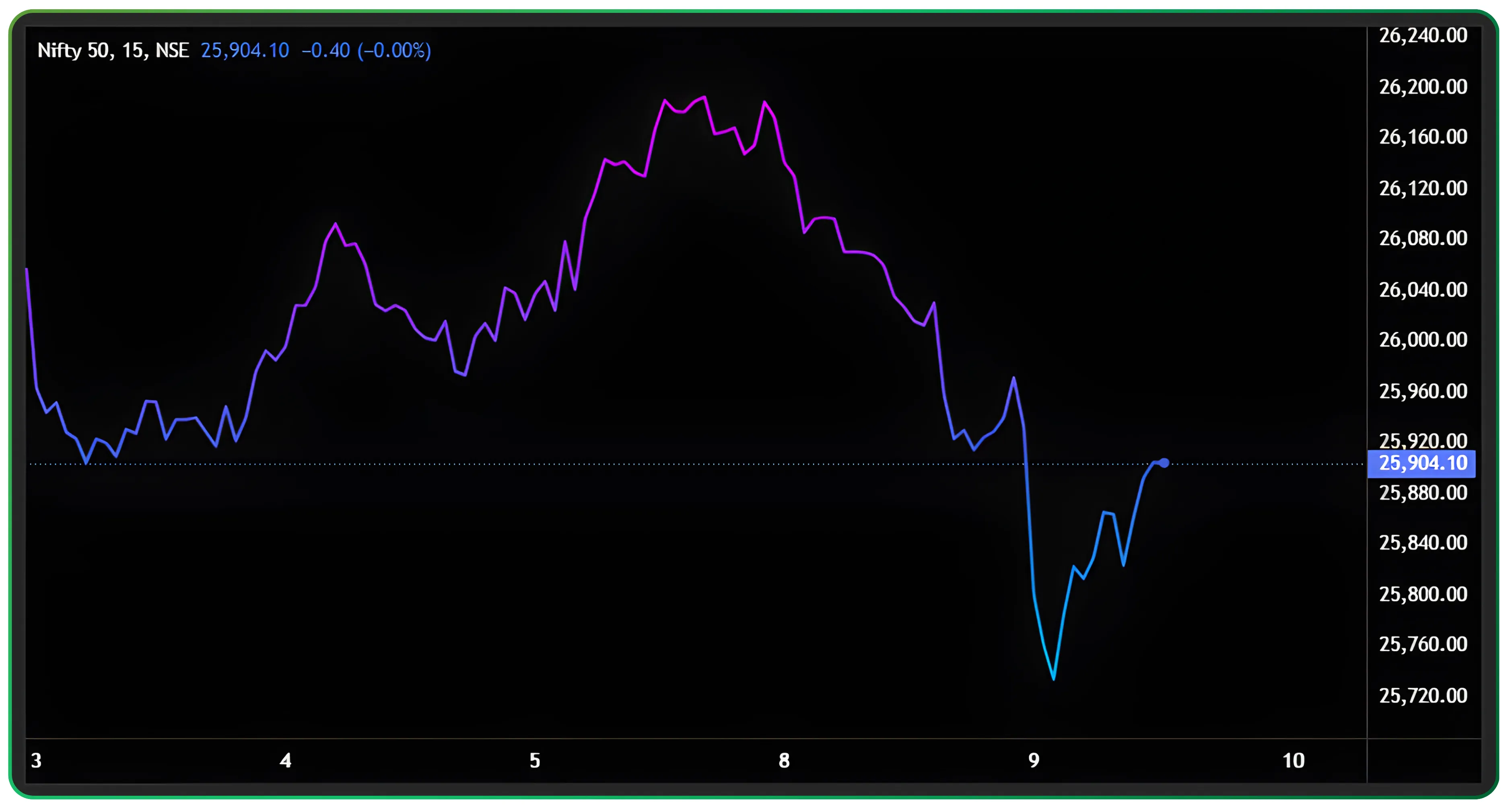
The line chart is the simplest chart you’ll see in trading. It only plots one price (usually the closing price of each day) and connects these points to form a continuous line. Because of this, line charts are very easy to read and quickly show whether the market is going up, down or moving sideways. But the same simplicity is also a limitation. A line chart ignores the open, high and low prices of the day, so you miss a lot of information about how the price actually moved. It’s like only knowing the final score of a match without seeing what happened during the game. That’s why line charts are useful for a quick view, but not enough for serious technical analysis.
Bar Chart
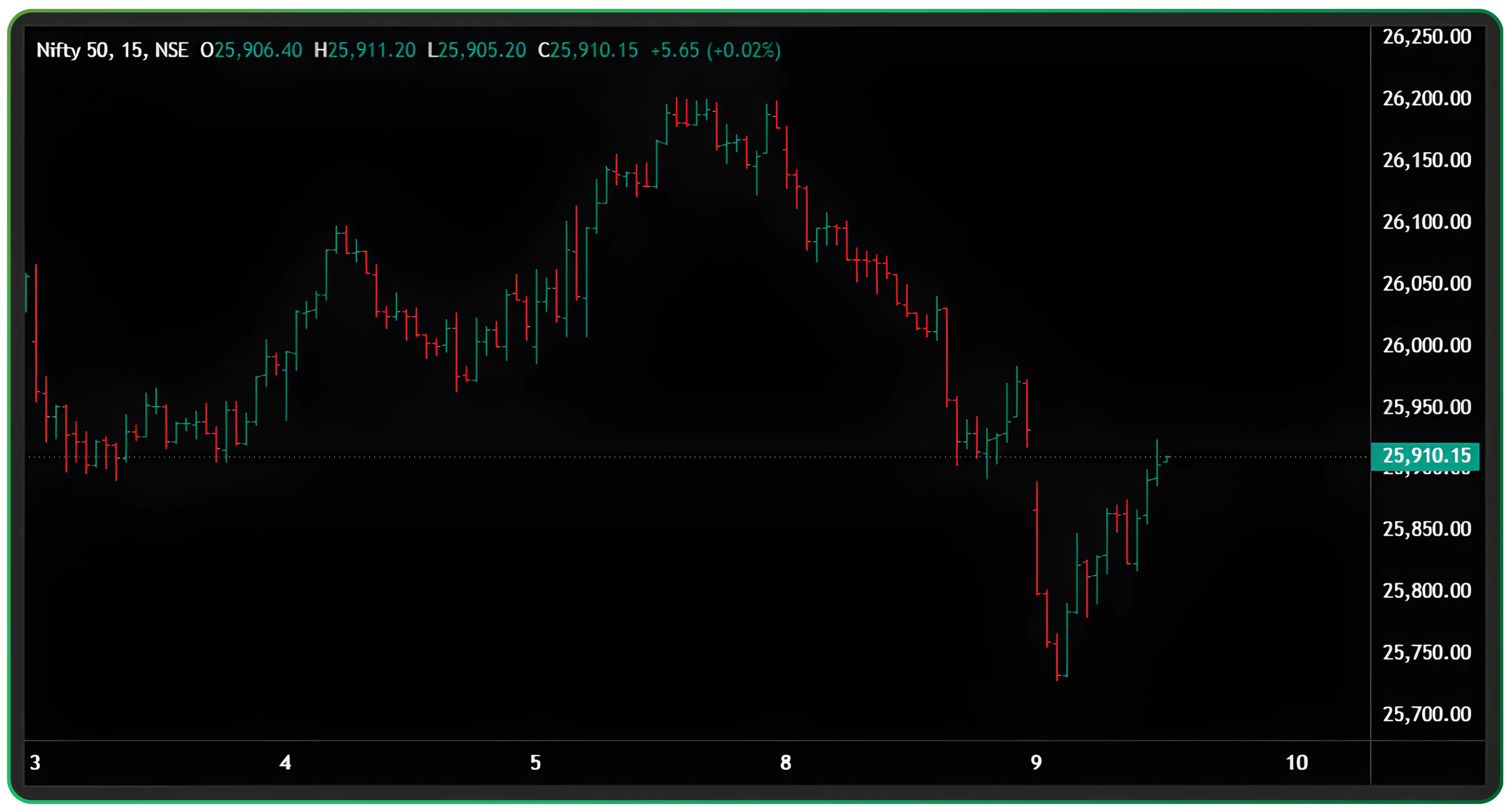
The bar chart shows all four major prices—open, high, low and close—in a single bar. The top of the bar shows the highest price, the bottom shows the lowest, and tiny marks on the left and right show where the price opened and closed. This makes the bar chart much more detailed than a line chart. You can clearly see if the day was bullish or bearish and how wide the price range was. However, even though bar charts provide more information, they can look cluttered and lack visual clarity. When you look at many bars together, it becomes hard to spot patterns quickly. Because of this, bar charts are used much less these days, and most traders prefer candlestick charts instead, which show the same information more clearly and visually.
Japanese Candlesticks
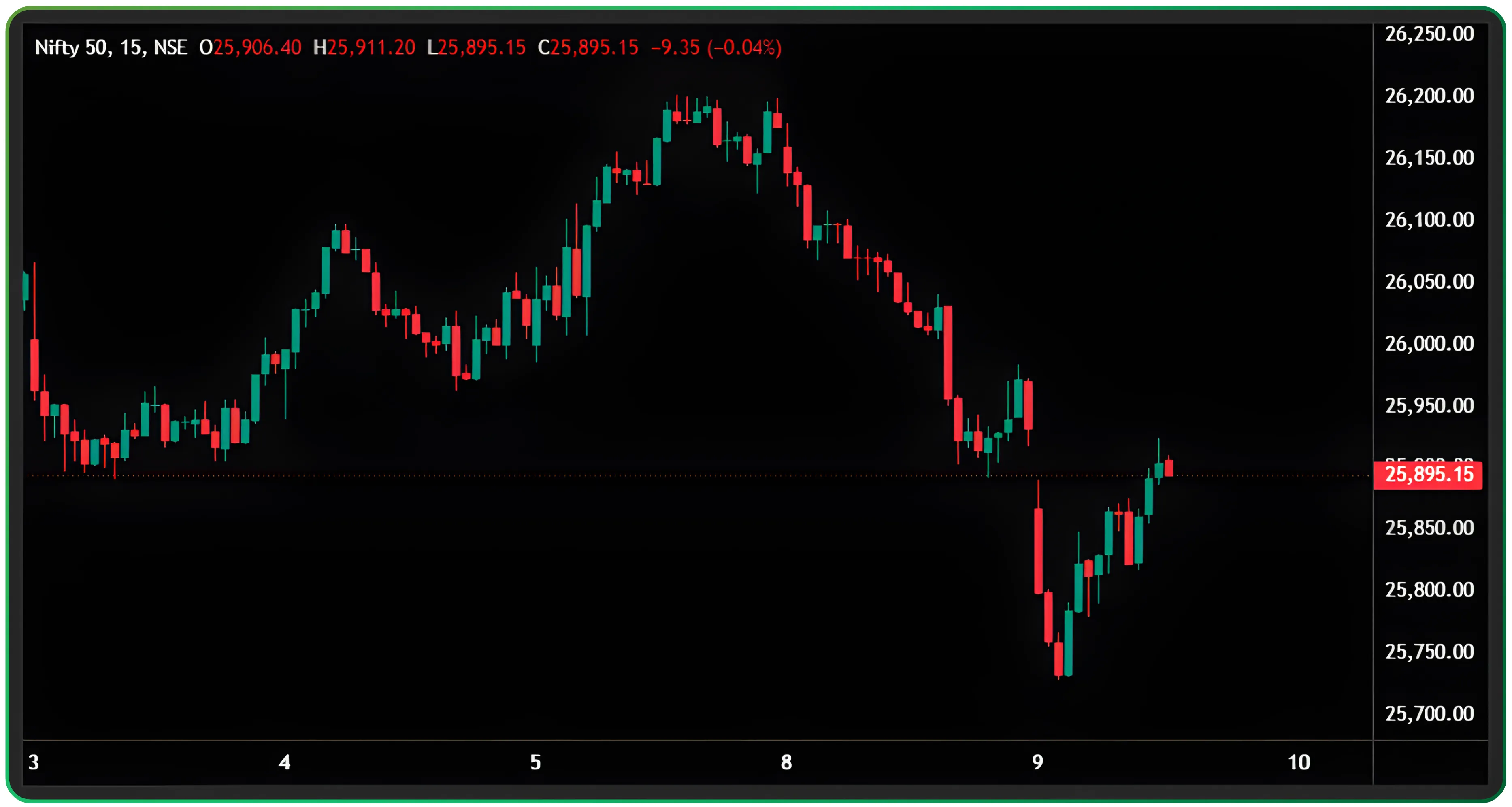
Candlestick charts were first used in Japan in the 1700s by a rice trader named Homma Munehisa. But western traders didn’t know about them until the 1980s, when Steve Nison introduced the method through his book named Japanese Candlestick Charting Techniques. Many candlestick patterns still keep their original Japanese names.
A Japanese candlestick is basically a price bar that shows how a stock moved during a particular time. It tells you where the price opened, how high it went, how low it fell, and where it finally closed. This makes it easy to see whether buyers were strong or sellers were in control. Candlesticks were first used by Japanese rice traders, and today they are a very common tool in technical analysis because they show a lot more information than a simple line chart. By studying different candlestick shapes, traders can guess if the market might continue its trend or reverse direction. Each candlestick has two main parts. The body shows the difference between the opening and closing prices. If the closing price is higher, it becomes a bullish candle (usually green). If the closing price is lower, it becomes a bearish candle (usually red). The thin lines above and below the body, called wicks, show the highest and lowest prices during that time.
Also Read: Everything you need to know about candlestick
Candlesticks show the same prices as bar charts, but in a clearer visual way. The thick body shows where the price opened and closed, and the thin lines (wicks) show the highest and lowest points of that period. If the candle closes higher than it opened, it becomes a bullish candle (usually green). If it closes lower, it becomes bearish (usually red). Longer bodies show stronger price moves, while shorter bodies mean weaker movement. Overall, candlesticks are easier to read and help traders quickly understand what happened in the market using Bullish Bearish candlestick body wicks logic.
Understanding Time Frames
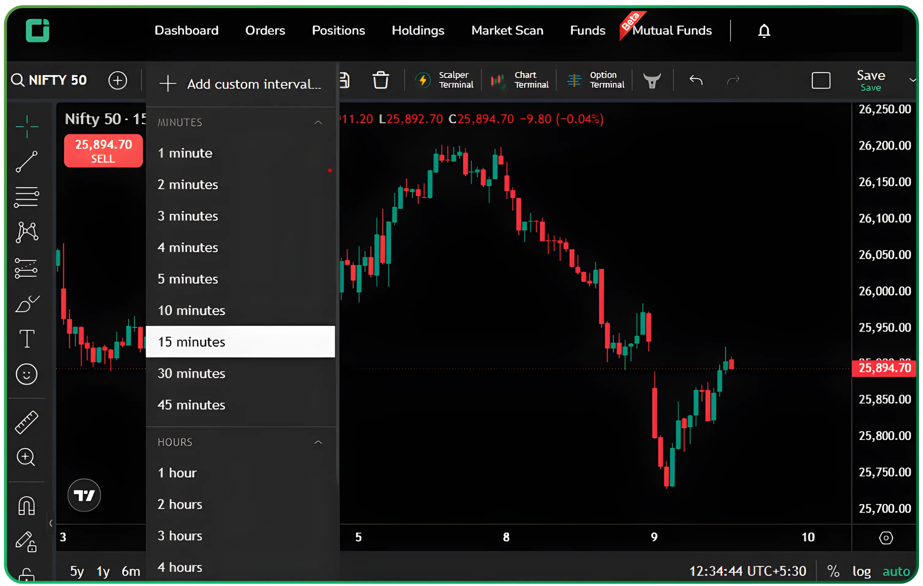
A time frame simply means the period of time each candle represents on a chart. Traders can choose any time period based on how they trade. For example, monthly, weekly, daily, or minute-based charts. This is the foundation of how to use chart time frames for trading.
Long-term traders usually look at bigger time frames like weekly or monthly charts because they show the bigger picture. Short-term traders prefer shorter time frames like 30-minute or 15-minute charts because they want to catch quick moves. High-frequency traders may even look at one-minute charts.
The smaller the time frame, the more candles you will see, which means more price data. But more data also means more noise and random movement. So if you are investing for the long term, focus on weekly or monthly candles. If you are day trading, look at daily or 15-minute charts.
Choosing the right time frame is very important because it helps you find useful information without getting confused by unnecessary price movements. In short, always pick the time frame that matches your trading style.
Key Takeaways
Chart patterns are not random shapes.
They represent real buyer and seller behaviour and help traders understand where the price could move next.
Different chart types show different levels of information
Line charts are simple, bar charts give more detail, but candlestick charts are the most useful because they show price movement clearly.
The right time frame depends on trading style.
Long-term investors should focus on weekly or monthly charts, while intraday traders should look at short time frames like daily or 15-minute charts.
Start yours with smart investing on CubePlus and take control of your financial goals.
Start yours with smart investing on CubePlus and take control of your financial goals.
Disclaimer: The information provided in our blogs is for informational purposes only and should not be construed as financial, investment, or trading advice. Trading and investing in the securities market carries risk. Always conduct your own research and consult with a qualified financial advisor before making any investment decisions. Past performance is not indicative of future results. Copyrighted and original content for your trading and investing needs.
© 2025 — Tradejini. All Rights Reserved.