


At its core, Point & Figure (P&F) charting explained the pure battle between supply and demand, free from the noise of time. Unlike candlesticks or bar charts that track every tick, P&F vs a candlestick chart focuses solely on price movement, plotting Xs for rising prices (demand) and Os for falling prices (supply). This simplicity makes it a direct visual representation of the law of supply and demand P&F chart, the same principle that governs prices of everything from tomatoes to Tata Steel shares.
To know about the evolution of Candlesticks read: Everything you need to know about candlestick.
When buyers outweigh sellers, demand dominates, and X-columns expand upward. When sellers gain control, Os take over. Over time, these Xs and Os form repetitive patterns Double Top Double Bottom P&F, Triangles, or Triple Breakouts that signal shifts in market control. P&F chart patterns are not time-dependent. They can take hours, days, or weeks to form depending on volatility. What matters is not when price changes, but how much it changes. This unique design filters out market noise and highlights true directional intent.
Traders rely on P&F patterns to identify trend reversals and breakouts without emotional bias. Before learning how to read individual setups like the Double Top or Bearish Triangle, one must first understand why these patterns exist — the underlying economics of price movement.
Component Breakdown
| Component | Pattern Type | Description | Ideal Duration |
|---|---|---|---|
| X Column | Demand | Price rises by the box size or multiple, shows buyers dominating | Variable |
| O Column | Supply | Price falls by the box size or multiple, shows sellers in control | Variable |
| Box Size | Price Unit | Minimum move recorded (e.g., ₹5 or ₹10 per box) | User-defined |
| Reversal Amount | Filter | Number of boxes needed to reverse from Xs to Os | Typically 3-box reversal |
| Pattern Zone | Consolidation | Area where demand and supply temporarily balance | Can last several columns |
| Breakout | Confirmation | Occurs when a new X or O exceeds prior column limit | Immediate |
Each component acts as a record of action, not reaction. Where candlesticks show hesitation, P&F charts show a decisive transfer of control based on P&F box size reversal amount.
Candlestick vs. Point & Figure: Two Views of the Same Price
Chart 1: Candlestick (Time-Based)
- Each bar represents one trading day, capturing open, high, low, and close prices.
- Every candle forms regardless of whether the price moved significantly or not.
- The result is a continuous record of time, even when price action is mostly sideways.
- Traders use it to study short-term volatility, sentiment shifts, and intraday reactions.
To read more about single candle stick patterns read: How to Use Single Candlestick Patterns Effectively.
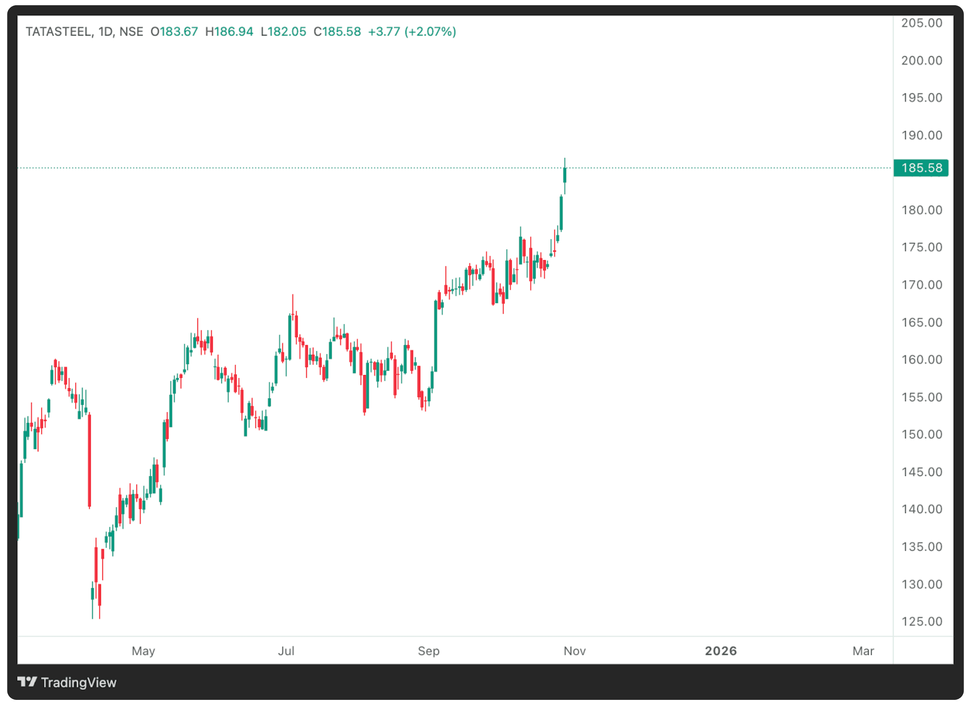
Chart 2: Point & Figure (Price-Based)
- Here, time is ignored; the chart updates only when price moves by a defined box size.
- In this example, the P&F chart is set to 1-point box size with 3-box reversal.
- Rising X-columns mark demand dominance, while falling O-columns mark supply dominance.
- The result is a cleaner map of trend structure, filtering out market noise.
- Long stretches of inactivity don’t produce new columns, making trends easier to spot and false signals fewer.
Interpretation
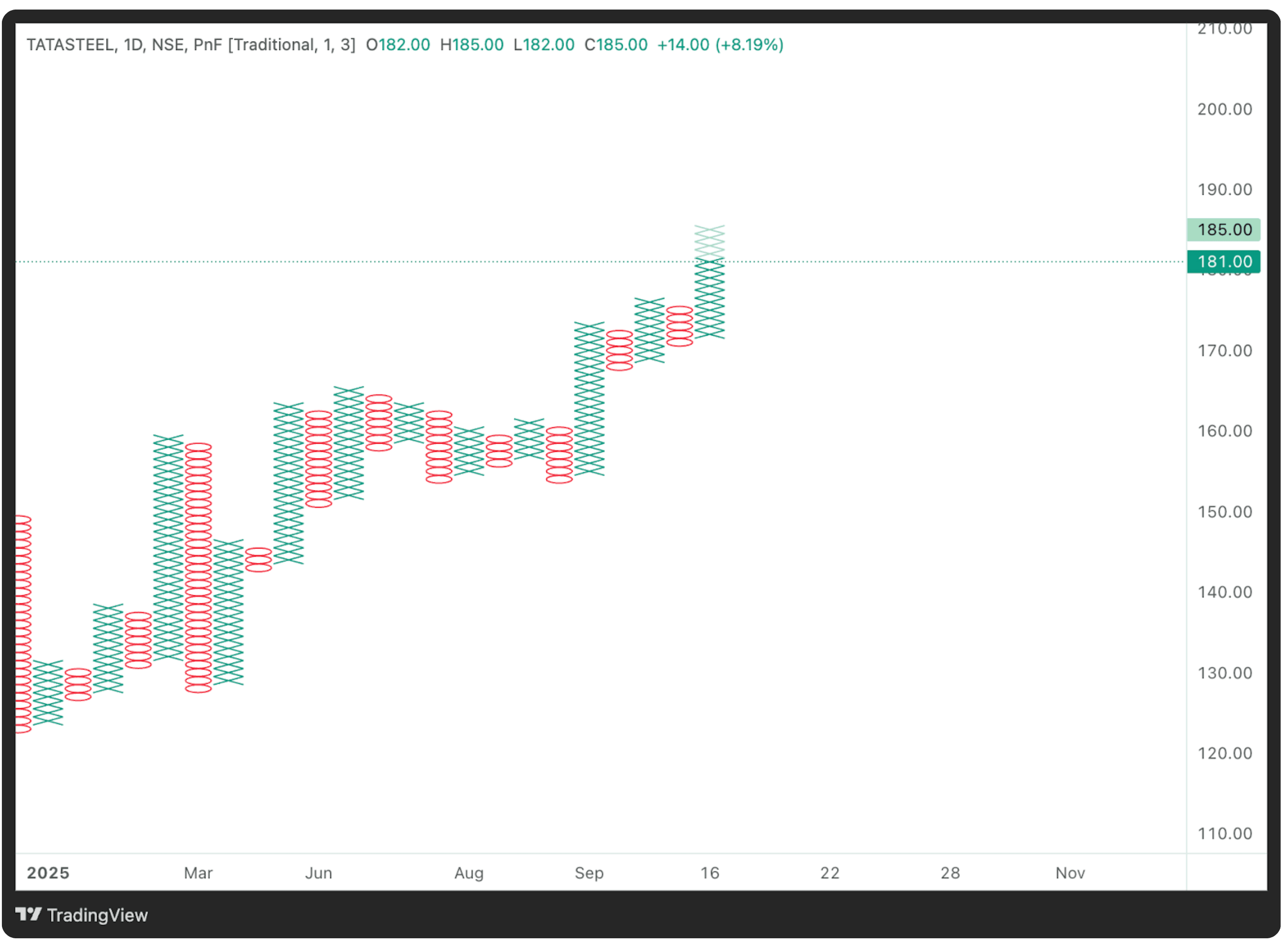
In the Tata Steel example, the candlestick chart shows day-to-day volatility and gaps, while the Point & Figure (P&F) charting explained approach abstracts away time, revealing clear zones of accumulation and breakout without distraction. Notice how the recent bullish breakout near ₹185 appears more structured and confirmed on the P&F chart — a classic representation of supply and demand P&F chart where demand overtakes supply.
Visual Identification Guide
Here’s exactly what to look for when scanning Point & Figure (P&F) charts:
Spot the Balance Zone
Identify where columns of Xs and Os alternate frequently without major progress — a price equilibrium.Locate the Breakout Column
The first X-column that exceeds a previous high (Double Top) or the first O-column that falls below a previous low (Double Bottom) marks control shift.Note the Box Size Setting
A smaller box size captures short-term swings, while a larger box size filters noise and focuses on meaningful trend shifts. Understanding the P&F box size reversal amount here improves precision.Observe Column Lengths
Long uninterrupted columns indicate strong conviction, either aggressive buying or panic selling. Short alternating columns imply uncertainty or consolidation.Check for Repetition
P&F patterns repeat because human behavior repeats. Look for structures like Double Top Double Bottom P&F, Triple Bottoms, and Catapults. Consistency in form often precedes consistency in results.Volume Context (if integrated)
When volume tools are available, validate the breakout column with an expansion in volume. Supply absorption or accumulation is often visible here.Confirmation through Relative Strength
Compare the stock’s P&F pattern to a benchmark index. A breakout confirmed by relative strength expansion adds reliability.
Smart Tips
- Tip 1: Always use a fixed box size when comparing multiple charts.
- Tip 2: Zoom out to spot recurring formations.
- Tip 3: Wait for 3-box confirmation before labeling any breakout.
Market Psychology & Context
Understanding why Point & Figure (P&F) charting explained works means understanding how markets think.
When a P&F column of Xs forms, it reflects persistent buying pressure each new X means traders are willing to pay higher prices. Conversely, Os signal persistent selling.
This tug-of-war forms the essence of every market.
When balanced, price oscillates the pattern formation phase.
When price breaks out, it’s the visible result of invisible accumulation or distribution.
Every P&F pattern represents psychology of imbalance moments when one emotion, fear or greed, outweighs the other.
Quick Recap: Bullish and Bearish Patterns
Bullish Pattern Recap
- Formation: New X-column breaks above prior X high (Double Top Double Bottom P&F).
- Signal: Demand overtakes supply.
- Volume Behavior: Renewed buying activity or sector strength.
- Best Use: Combine with market breadth or moving averages.
Bearish Pattern Recap
- Formation: New O-column breaks below prior O low (Double Bottom pattern in P&F chart).
- Signal: Supply dominates.
- Volume Behavior: Expands during sharp declines.
- Best Use: Confirm with declining relative strength.
Practical Construction Example
How Point & Figure Charts Are Constructed
Here’s a numerical step-by-step example showing how a P&F chart is built using absolute numbers, no percentages, no complex scaling.
Setup:
- Box size: ₹2 (each X or O = ₹2 move)
- Reversal: 3-box (₹6 move to reverse)
- Price data (closing): ₹100, ₹102, ₹104, ₹106, ₹108, ₹110, ₹108, ₹106, ₹104, ₹102, ₹100, ₹98, ₹96, ₹94, ₹96, ₹98, ₹100
Step 1 - Start the First Column
From ₹100 → ₹106 (₹6 move upward)
₹6 ÷ ₹2 = 3 boxes → Draw 3 X’s.
Column 1 (X): 100, 102, 104, 106
Step 2 - Continue the Same Trend
Prices climb to ₹110 → Add 2 more X’s.
Column 1 (X): 100, 102, 104, 106, 108, 110
Step 3 - Check for Reversal
Price declines ₹110 → ₹104 → ₹6 fall (3-box rule met).
Start new O-column.
Column 2 (O): 108, 106, 104
Step 4 - Extend the Downtrend
Price continues to ₹94.
Column 2 (O): 108, 106, 104, 102, 100, 98, 96, 94
Step 5 - Reversal Again
Prices rebound ₹94 → ₹100 → ₹6 rise.
Column 3 (X): 96, 98, 100
Final Simplified Chart:
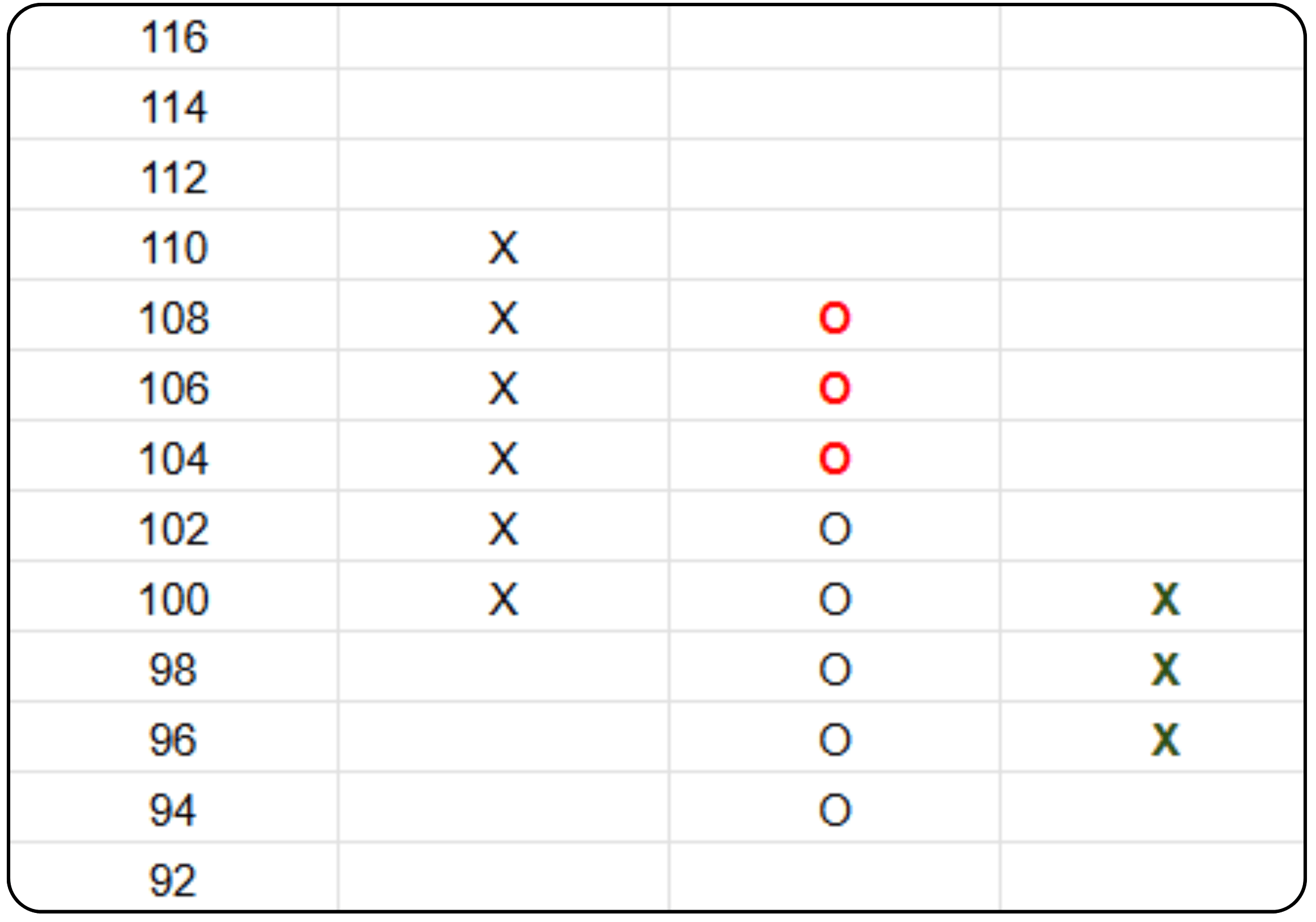
This demonstrates how P&F chart construction step by step converts raw price action into a structured representation of supply and demand.
Understanding the Mechanics
- Box Size: Defines sensitivity. A ₹2 box captures moderate price steps, tight enough to show structure, wide enough to avoid noise. Intraday traders might prefer ₹1 boxes; positional traders may use ₹5 or ₹10.
- Reversal Amount: Prevents overreacting to small fluctuations. The 3-box rule ensures only meaningful reversals appear.
- Column Logic: Each column continues until the price moves against it by the reversal amount.
Traditional vs. ATR-Based Scaling
- Traditional Method: Uses a fixed rupee box size (₹2, ₹5, etc.) across the chart. Ideal for stable-price instruments or consistent volatility.
- ATR-Based Method: Dynamically adjusts box size based on the Average True Range
- (ATR). High-volatility assets get larger boxes; quiet markets get smaller ones.
- Advantage: Keeps pattern sensitivity proportional to volatility.
- Trade-off: May distort long-term comparisons since box size shifts over time.
Professional traders often start with traditional scaling for clarity and then validate signals using an ATR-based scaling P&F chart to account for volatility conditions.
This simple three-column example demonstrates the essence of P&F charting, price action filtered through structure. Every X and O captures supply-demand shifts without noise or subjective bias.
Strategic Summary
The law of supply and demand governs all markets. Point & Figure (P&F) charting explained this law in its most distilled form. Each X and O represents a decision by traders reacting to scarcity or surplus.
The strategic power of P&F lies in its ability to show true price intent without emotional noise. It teaches traders to think probabilistically, much like a basketball player taking two free throws, each trade is independent, and success depends on executing both entry and exit correctly.
When combined with fundamental analysis, the synergy becomes potent. Fundamentals tell what to buy; Point & Figure analysis tells when to buy. A fundamentally strong stock controlled by supply is like driving south when the goal is north, it’s directionally wrong. P&F helps avoid that mistake.
By recognizing repeating structures, traders gain a structured edge grounded in behavioral economics. Over time, consistent pattern recognition improves timing, risk control, and conviction.
By recognizing repeating structures, traders gain a structured edge grounded in behavioral economics. Over time, consistent pattern recognition improves timing, risk control, and conviction.
Use Point & Figure charts as a decision filter, not a standalone signal. Pair them with volume, sector strength, and moving averages for confirmation. The method doesn’t predict the future; it quantifies the present balance of power.
To know more about volume in trading read: What is Volume in Trading?
In a market driven by human reflex and institutional strategy, this timeless visual approach remains one of the most efficient ways to decode price battles.
Technical Specifications
| Specification | Guideline | Explanation |
|---|---|---|
| Chart Type | Point & Figure | Uses Xs and Os to represent price movement |
| Box Size | User-defined | Determines sensitivity; smaller = more signals |
| Reversal Criterion | 3-box | Standard for noise filtering |
| Ideal Timeframe | Daily or Weekly | Reduces false reversals |
| Volume Integration | Optional | Improves breakout confirmation |
| Best Market Conditions | Trending markets | Offers clean continuation signals |
| Worst Market Conditions | Sideways/choppy | Can generate false reversals |
| Target Estimation | Box count × box size | Simple projection method |
| Confirmation Tools | Volume, RSI, Moving Averages | Essential for entry validation |