


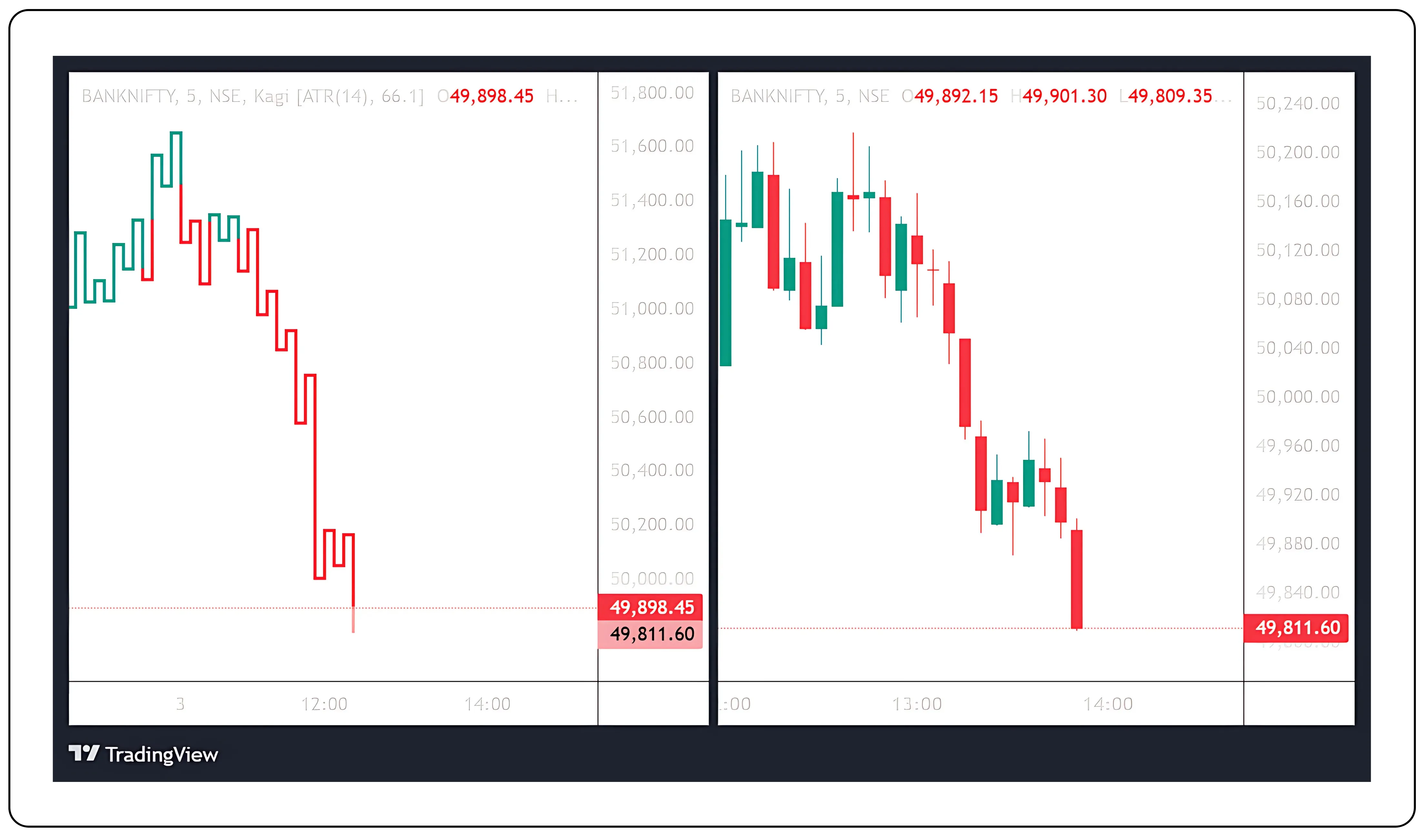
As Maya explored the world of technical analysis, kagi charts captured her attention with their distinctive focus on price movement. Unlike traditional charts that consider time, Kagi charts concentrate on market trends by ignoring time intervals and prioritizing significant price reversals. The reversal criteria she established helped determine when to change directions, while the overall structure of Kagi charts made them effective tools for identifying prevailing trends.
If you are curious about alternative ways to track trends, don’t miss our earlier piece on kagi charts and how Maya used them to spot reversals read it here.
Kagi chart formation
Maya had always been drawn to the intricacies of financial markets. One evening, as she sat at her desk surrounded by charts and graphs, she discovered Kagi bars and kagi candles are a unique form of technical analysis that piqued her interest. Unlike traditional charts that relied on time, Kagi charts focused solely on price movement and price reversal. Intrigued, she set out to understand how these charts were formed.
The Yin and Yang of kagi charts
As Maya continued exploring kagi charts, she discovered the fascinating concept of Yin and Yang lines, a metaphorical representation of market sentiment within these charts.
- Yang Lines (Thick Lines): Indicate bullish momentum and strength. When the price exceeds a previous high, the line thickens, signifying upward movement and confidence.
- Yin Lines (Thin Lines): Reflect bearish sentiment. A line becomes thin when the price falls below a previous low, signalling caution and downward pressure.
This interplay fascinated Maya, as it provided her with a visual metaphor for market sentiment shifts, helping her see trends unfold with clarity.
Price movement and reversal
Maya learned that kagi charts were constructed from a series of vertical lines that changed direction based on significant price movement. Each line could be either thick or thin, depending on the trend. A line would change direction when a price reversal occurred; this meant the price had to move a predefined amount in the opposite direction, which Maya noted was typically a fixed percentage or point value. It has predefined kagi chart formula which makes this lines appear.
- Upward Lines (Bullish): When the price rose by the set reversal amount, Maya would draw a thick line extending upward.
- Downward Lines (Bearish): Conversely, if the price fell by the same amount, the line would turn downward and remain thick.
Color coding for clarity
Maya noticed that kagi charts used colors to enhance clarity:
- Bullish (Upward): Thick lines, often green or white, indicated strength and optimism.
- Bearish (Downward): Thin lines, typically red or black, signaled caution and weakness.
The color change indicates the trend. A green (or white) line signifies that the asset is in an upward trend, and a red (or black) line signals a downward trend. This visual simplicity of identifying momentum shifts makes the Kagi chart for intraday trading and investing as it filters out market noise and focuses purely on price direction and trend strength. Traders often use Kagi chart patterns to confirm trend reversals, spot breakout levels, and avoid false signals in choppy markets, making it a valuable tool across various timeframes.
Line thickness and continuity
Maya learned that once a direction was established, the thickness of the line remained constant until a reversal occurred. If the price continued to move in favor of the trend, the line would extend without interruption. However, upon experiencing a price reversal, it would switch to thin and change color to reflect this new trend.
| Condition | Thickness Change | Color Change | Yin-Yang |
|---|---|---|---|
| Price exceeds previous high | Thick (bullish) | Green/White | Yang (Strength) |
| Price falls below previous low | Thin (bearish) | Red/Black | Yin (Weakness) |
| Price reverses by ATR value | Direction changes | Corresponds to trend | Reflects dynamic market shifts |
Example of thickness or Color Change
Initial Conditions:
- Current price: ₹100
- Previous high: ₹110
- Previous low: ₹90
- Reversal amount: ₹10
Scenario 1: Uptrend Continues
- If the price rises above ₹110 (previous high), the line becomes thicker (bullish) and changes color (e.g., to green/white).
Scenario 2: Downtrend Starts
- If the price falls below ₹90 (previous low), the line becomes thinner (bearish) and changes color (e.g., to red/black).
Establishing reversal amount
One of the key parameters in forming Kagi charts was the reversal amount. This was the minimum price movement required to trigger a change in direction. Maya realized that setting this threshold allowed her to filter out minor fluctuations, focusing instead on significant price shifts. For instance, if she set a reversal amount of 5%, the line would only change direction when the price moved 5% in the opposite direction from its current trend.
Through this, Maya understood that the Kagi chart strategy could help her stay on the right side of the trend by ignoring market noise and focusing only on meaningful price movements. As she explored further, she realized that kagi chart technical analysis offered a cleaner view of support and resistance levels, trend strength, and potential reversals—something that traditional time-based charts often failed to deliver. This made Kagi trading especially appealing for both intraday setups and longer-term market decisions, giving her a systematic way to follow price action with greater confidence.
Considerations for forming the chart
Price Movement: Kagi charts are solely based on price movements. Time is not considered. This allows Kagi charts to focus on major price shifts and provide a clearer picture of the market's general trend.
Reversal Criteria: The reversal criteria (percentage or point change) help determine when a line changes direction.
Trends: Kagi charts are effective for identifying trends since they highlight the prevailing market direction based on the price's movement rather than time intervals.
Maya’s key considerations for chart formation
Maya found that forming kagi charts required attention to three critical elements:
Incorporating ATR for reversal amount:
Maya decided to use ATR as a dynamic reversal criterion. This approach adjusted the sensitivity of her Kagi charts based on market volatility, helping her focus on meaningful price shifts and ignore minor fluctuations.
Interpreting Yin and Yang lines:
The interplay of Yin and Yang lines provided a unique perspective on market sentiment. By observing transitions between thick Yang lines and thin Yin lines, Maya could identify potential trend reversals and areas of consolidation.
Maya’s journey with kagi charts
With every new insight, Maya grew more confident in her ability to navigate market trends. The Yin-Yang dynamics and the adaptability of ATR transformed Kagi charts into a powerful tool for her trading strategy. By focusing on significant price movements and price reversals, Maya unlocked a deeper understanding of market sentiment.
As she continued her trading journey, Maya felt empowered to make decisions with clarity and confidence, knowing that Kagi charts would guide her through even the most volatile markets.
Ready to trade smarter? Explore the CubePlus trading terminal.
Disclaimer: The information provided in our blogs is for informational purposes only and should not be construed as financial, investment, or trading advice. Trading and investing in the securities market carries risk. Always conduct your own research and consult with a qualified financial advisor before making any investment decisions. Past performance is not indicative of future results. Copyrighted and original content for your trading and investing needs.
© 2025 — Tradejini. All Rights Reserved.