Tradejini Watchlist now provides two additional ways to monitor stocks: Nifty 500 and F&O Stocks. These watchlists help users scan a wider set of stocks without having to add each stock individually to a personal watchlist.
Until now, a watchlist showed only the stocks a user had added manually or Nifty & SENSEX, which works well for a short list of favourites. But when the market moves sharply, most traders want to see the bigger picture: which stocks are leading, which are falling, and where the volume is going. The new Nifty 500 and F&O Stocks lists make this possible in a single screen.
Both lists can be sorted by change % or by name, and the Nifty 500 list can also be viewed as a colour-coded heatmap. This article explains each feature and how it can be used in day-to-day trading.
Nifty 500: The Broad Market in One List
The Nifty 500 watchlist shows all 500 stocks of the Nifty 500 index in one place. It covers large-cap, mid-cap, and small-cap companies, which together represent the bulk of the market value listed on NSE.
To open it, go to the Index tab in the watchlist panel and select NIFTY 500. The same tab also has NIFTY, BANKNIFTY, SENSEX, and NSE Indices, so users can switch between different baskets quickly.
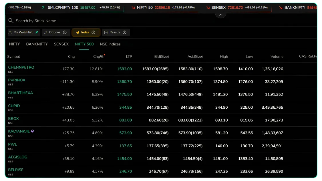
Because the list is maintained by Tradejini, there is no need to create it, update it, or add stocks one by one.
F&O Stocks: Every Derivatives Stock, Ready to Scan
The F&O Stocks watchlist lists all underlying stocks that are available for trading in the Futures & Options segment. These are generally the most liquid stocks in the market, and they are where most traders look for intraday and positional opportunities.
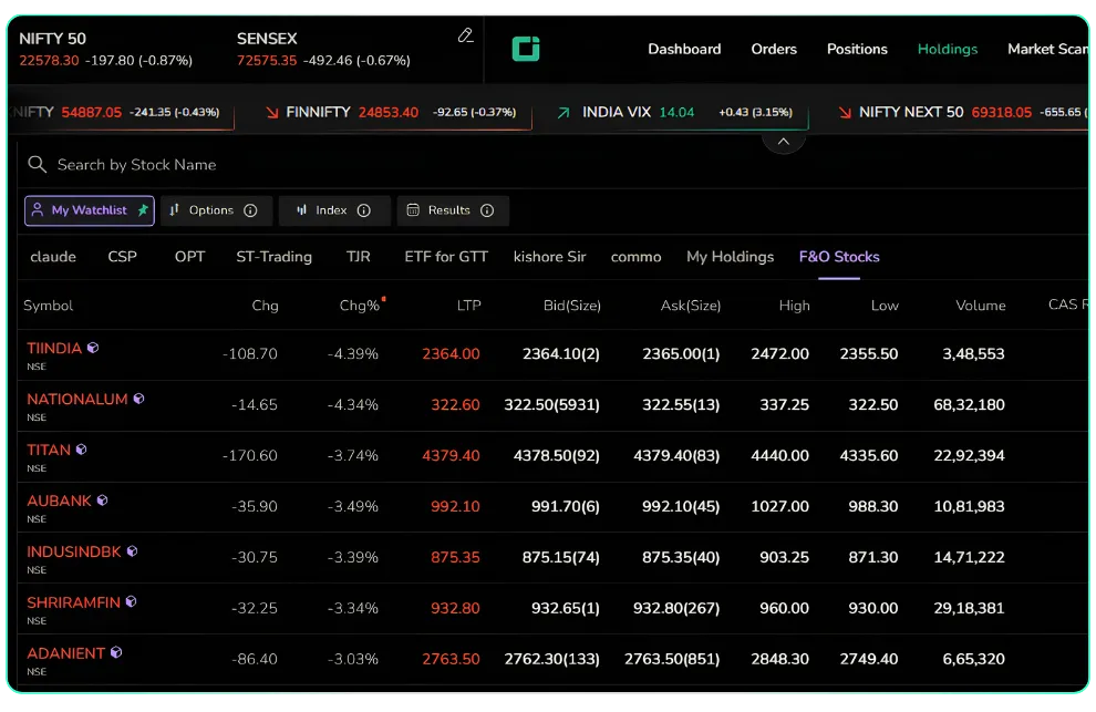
To open it, go to My Watchlist and select the F&O Stocks tab. It sits alongside the user's own watchlists, so moving between a personal list and the full F&O universe takes a single click.
The columns are the same as in Nifty 500: change, change %, LTP, bid and ask with size, day's high and low, and volume. F&O stocks (part of CAS) are also marked with a small icon next to the symbol, which helps identify them even inside the Nifty 500 list.
Sorting: The Feature That Makes a 500-Stock List Useful
A list of 500 stocks is only helpful if the user can find what matters quickly. That is where sorting comes in. Both the Nifty 500 and F&O stocks can be sorted in two ways.
Sort by Change %
Click the Chg% column header to arrange stocks by their percentage move for the day. A small dot next to the header shows that sorting is active on that column.
Highest to lowest puts the day's top gainers at the top. For example, on the Nifty 500 list, this brings stocks like CHENNPETRO (+12.61%), PVRINOX (+8.90%), and BHARTIHEXA (+6.39%) to the top.
Lowest to highest puts the day's biggest losers first. On the same day, this showed PFOCUS (−8.47%), VISL (−4.97%), and GLAXO (−4.64%) at the top.
On the F&O Stocks list, the same sort instantly shows which derivatives stocks are falling hardest, such as TIINDIA (−4.39%), NATIONALUM (−4.34%), and TITAN (−3.74%).
Sorting by percentage, rather than by rupee change, matters. A ₹100 move in a ₹4,000 stock is smaller than a ₹20 move in a ₹200 stock. Change % puts every stock on the same scale, so the comparison is fair.
Sort Alphabetically
Click the Symbol column header to arrange stocks from A to Z (or Z to A). This is useful when the user already knows which stock to check and wants to find it in the list without scrolling through 500 names, or when reviewing stocks in a fixed order every day.
In short, change % sorting answers to 'What is moving?' and alphabetical sorting answers to 'Where is the stock I want?’
How Traders and Investors Can Use These Lists
1. Spotting the day's top gainers and losers. Open Nifty 500, sort by Chg% from high to low, and the strongest stocks of the day are on the first screen. Reverse the sort to see the weakest. This takes seconds instead of building a scanner.
2. Finding F&O trading candidates. Options and futures traders need stocks that are both moving and liquid. Sorting the F&O Stocks list by Chg% shows the biggest movers, and the Volume column confirms whether the move has participation behind it. A stock down 4% on heavy volume tells a different story from one down 4% on thin volume.
3. Reading market breadth. On a day when Nifty 50 is down nearly 0.9%, a quick scroll through the sorted Nifty 500 list shows whether the fall is broad or limited to a few heavyweights. If many mid-caps and small-caps are still in the green, the weakness is concentrated, not widespread.
4. Spotting sector themes. When several stocks from the same sector appear together at the top or bottom of a sorted list, it often points to a sector-wide move. For instance, refiners such as CHENNPETRO and MRPL both rising strongly on the same day suggests a theme worth checking.
5. Discovering stocks outside the personal watchlist. A personal watchlist only shows what the user already follows. The Nifty 500 list brings up companies the user may never have added, which can lead to new research ideas.
6. Daily review in a fixed order. Investors who track the full F&O universe or the broader market can use alphabetical sorting to go through the list the same way every day, without missing any name.
Heatmap View: The Market at a Glance
For users who prefer a visual picture over a table, the Nifty 500 list can also be shown as a heatmap. Use the view toggle icon at the top right of the watchlist panel to switch between the list view and the heatmap view.
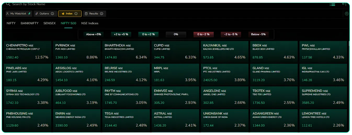
In the heatmap, each stock appears as a tile showing its symbol, company name, last traded price, and change %. The tile's colour shows how much the stock has moved:
| Colour band | Price change for the day |
|---|---|
| Darkest green | Above +5% |
| Green | +2% to +5% |
| Light green | 0% to +2% |
| Grey | 0% (unchanged) |
| Light red | 0% to −2% |
| Red | −2% to −5% |
| Darkest red | Below −5% |
The tiles are arranged by change %, so the biggest movers appear first. A screen full of green means a strong, broad rally. A screen full of red means broad selling. A mix of both tells the user that the market is divided and stock selection matters more than direction.
The heatmap is best for a quick first look, for example, at market open or before placing a trade. Once something catches the eye, the user can switch back to the list view for exact prices, bid-ask, and volume.
Disclaimer: The information provided in our blogs is for informational purposes only and should not be construed as financial, investment, or trading advice. Trading and investing in the securities market carries risk. Always conduct your own research and consult with a qualified financial advisor before making any investment decisions. Past performance is not indicative of future results. Copyrighted and original content for your trading and investing needs.
© 2026 — Tradejini. All Rights Reserved.