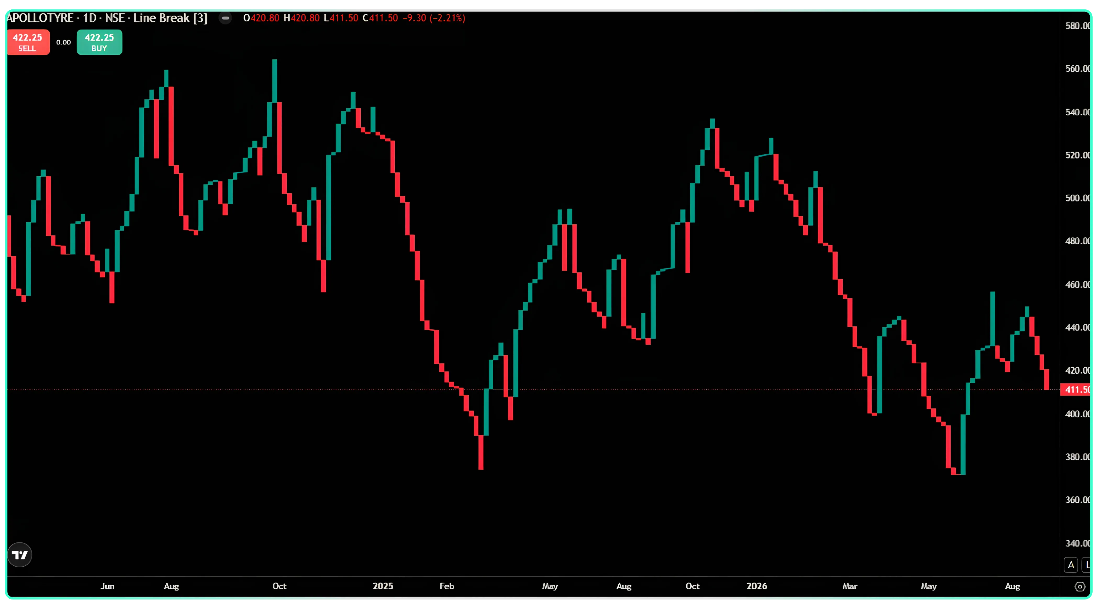
Line-break charts were developed by Japanese rice traders in the 1800s. You’ll usually see this method referred to as a Three-Line Break chart because three is the default setting used to trigger a reversal. However, this number is not fixed and can be set to almost any value.
Building the Chart, Step by Step
Start with a basic line chart based on a stock’s closing prices, with each price represented as a point connected to the next. Instead of connecting these points with lines, imagine drawing a box between each pair of closing prices. Repeating this for every closing price turns the chart into a series of stacked boxes rather than a continuous line.
Each box is then given a color based on the direction of the price movement. A green box represents a higher close, while a red box represents a lower close.
At this point, the chart looks quite different from a standard line chart, as it uses colored blocks to show the direction of price movement.
However, not every box adds new information. Some boxes fall entirely within the range of the previous box, so they do not add anything meaningful to the chart. Removing these boxes leaves a cleaner view that focuses only on the price movements that matter. Connecting the remaining boxes gives us the line-break chart.
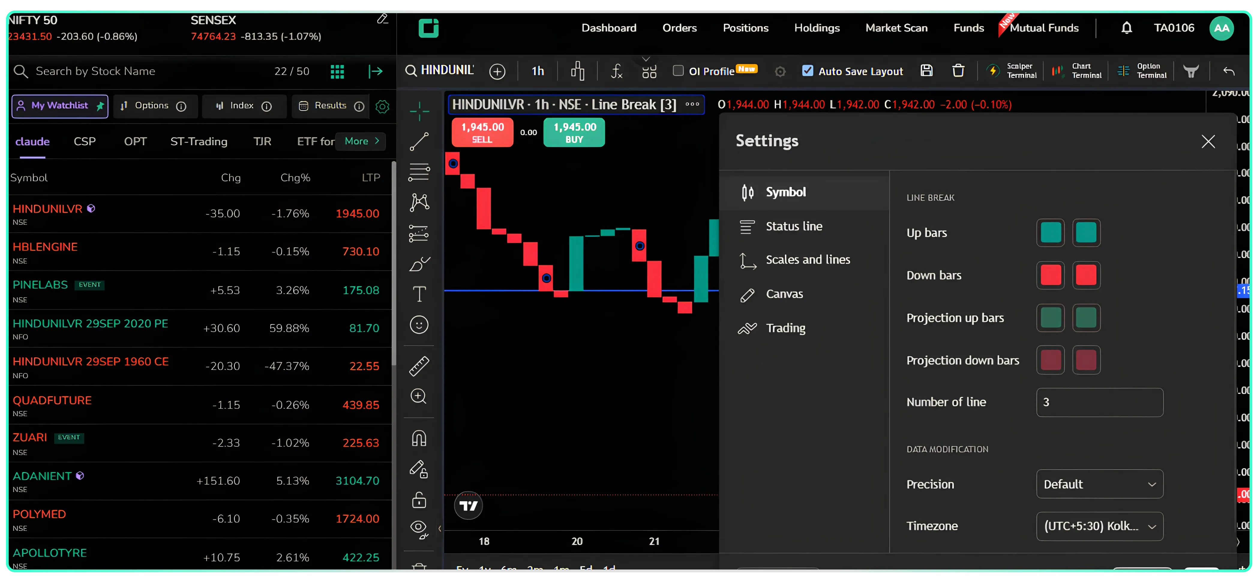
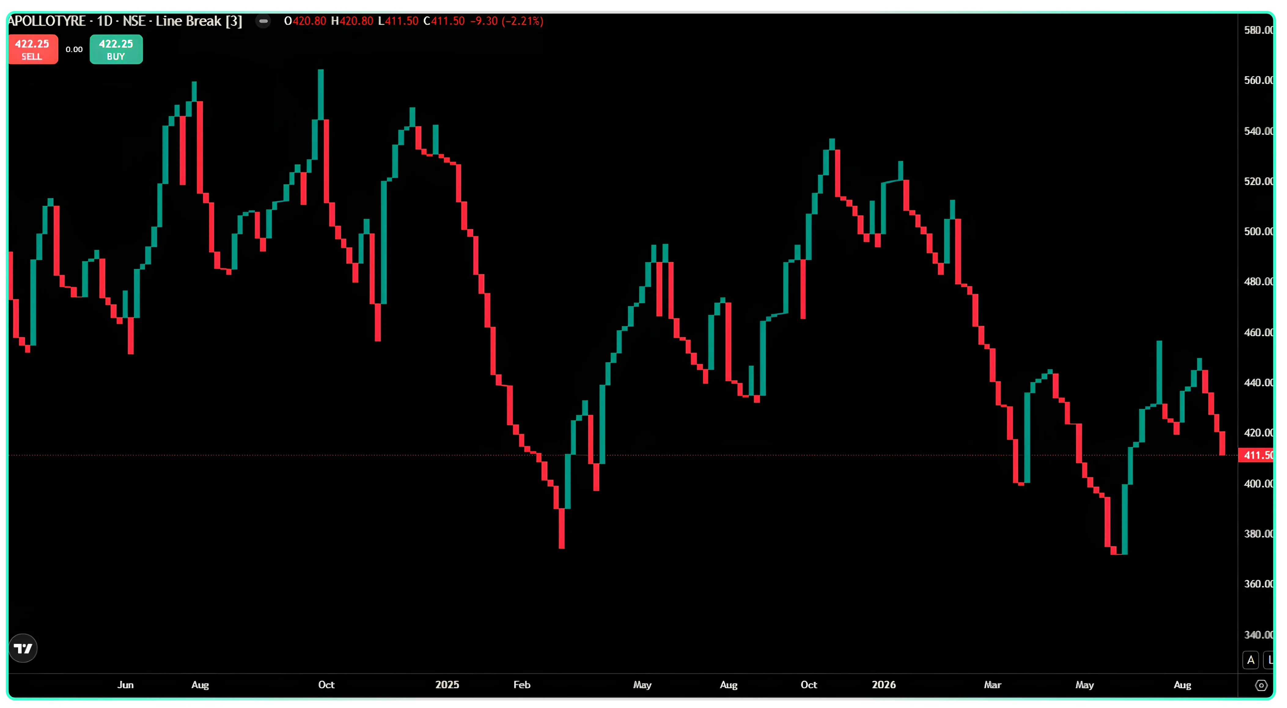
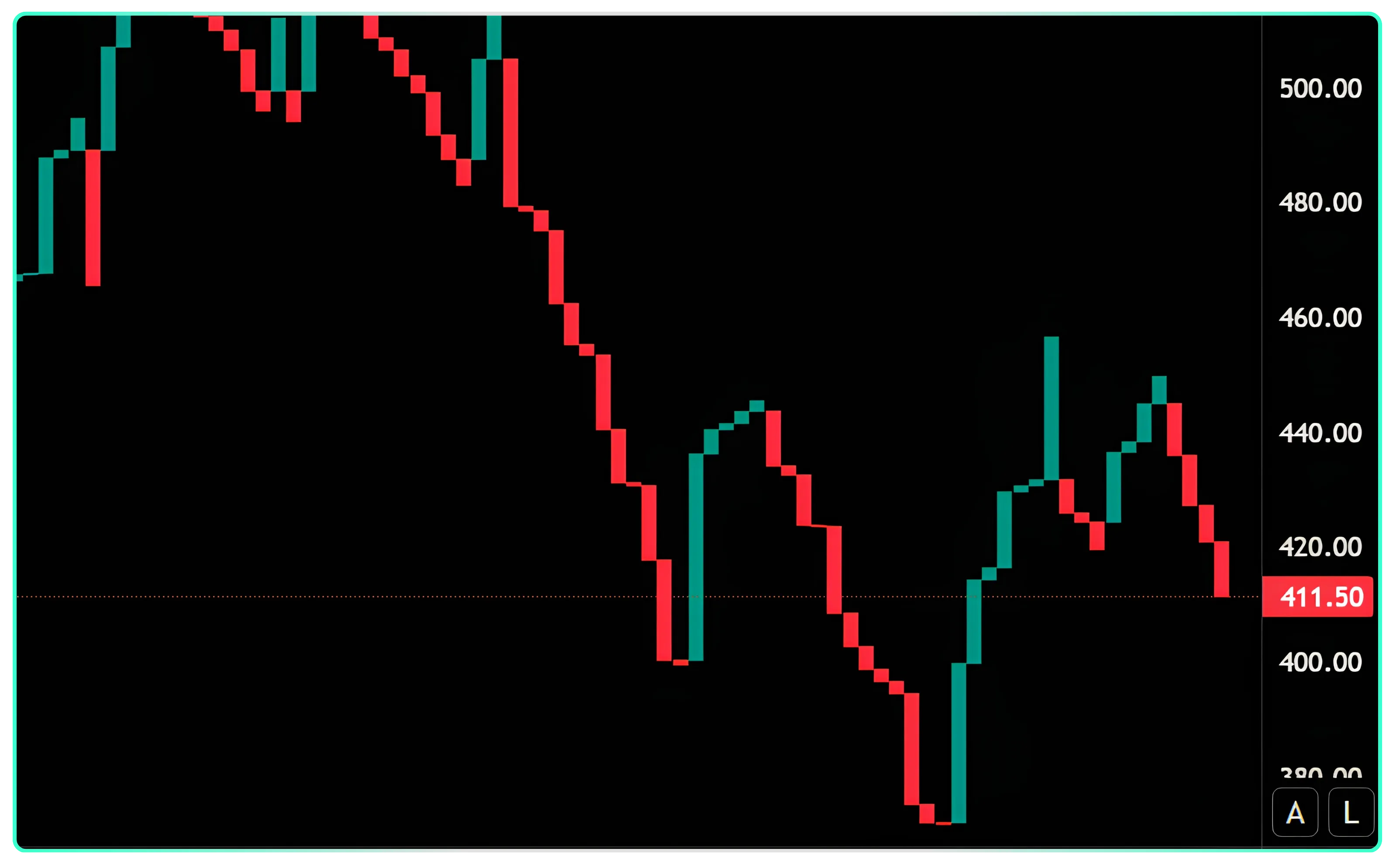 This chart is a Three-Line Break chart. Each colored box represents a line, and the number of lines considered when determining a reversal is 3. Most charting platforms show this as the reversal value setting. Here’s how the red and green boxes on the chart are formed.
The Rule, in Plain Terms
- While the price is in a red, bearish run, a new green box appears only when the price rises above the high of the last three red boxes.
- While the price is in a green, bullish run, a new red box appears only when the price falls below the low of the last three green boxes.
- As long as the price remains within that range, the chart continues in the same color. No new box is added, and there is no change in direction.
Walking Through the Chart
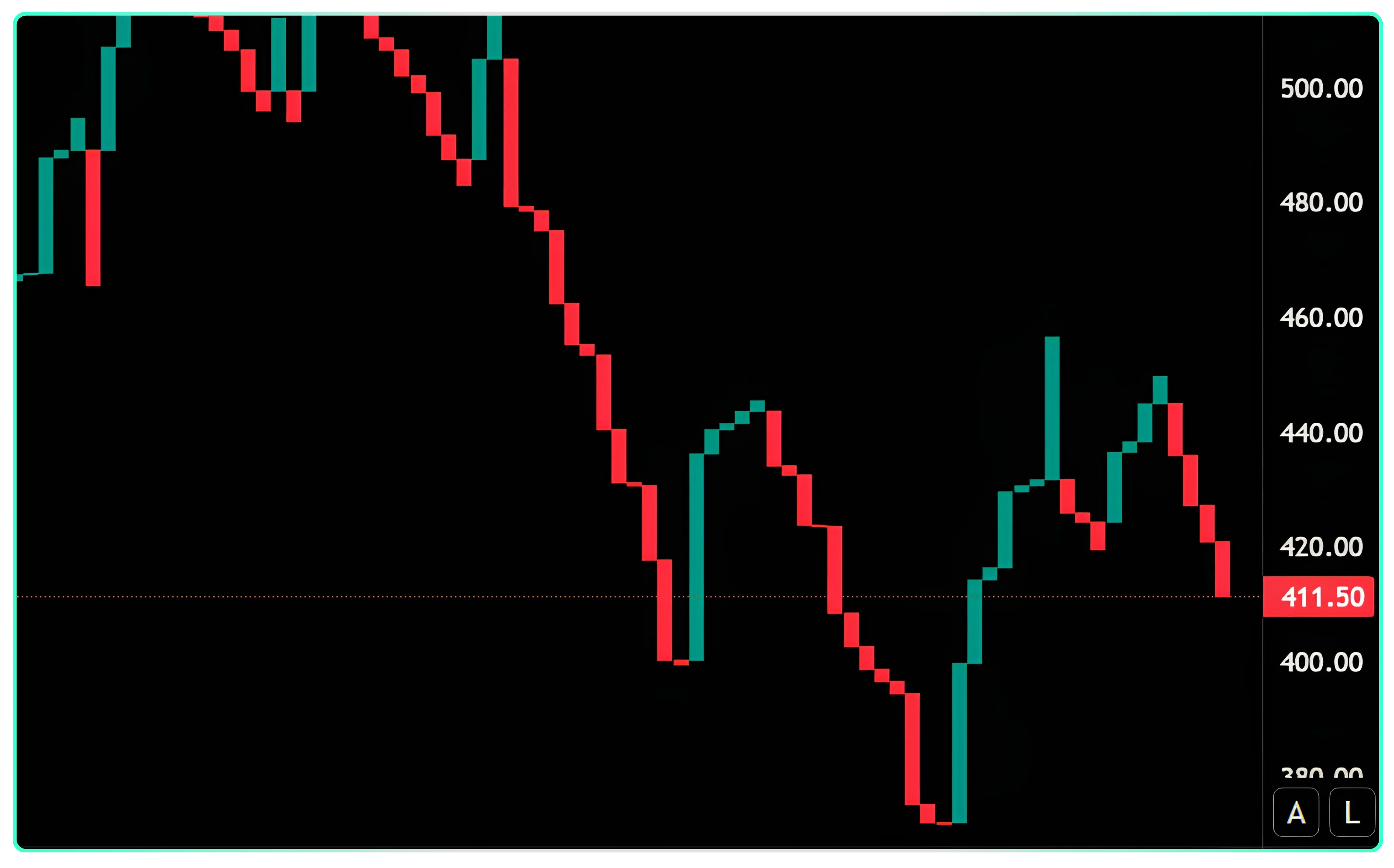
Top-left downtrend (~500 → ~400)
You can see a long, uninterrupted stretch of red boxes. Each new red box shows that the price continued to make lower lows, breaking below the lows of the earlier boxes. Although the price occasionally moved higher during a session, it never closed above the high of the last three red boxes. As a result, no green box was formed. This is why the decline appears as one long red staircase rather than frequently changing color.
First green box (~400)
The price eventually rallied enough to close above the high of the last three red boxes. This move was strong enough to reverse the chart and form a green box. That is why the green box is much taller than the small red boxes immediately before it. A single line is capturing a relatively large price movement.
Green run up to ~445, then red again
Once the green boxes start forming, the same rule applies in the opposite direction. The price must close below the low of the last three green boxes before a red box can appear. In the chart, a short green run is followed by a red box when the price falls far enough to break that level.
The choppier section on the right (~410–455)
This section is a good example of how the three-line reversal rule filters price movements. The price moves back and forth, but each new box must still break the extreme of the last three boxes of the opposite color. As neither side is making a decisive move beyond that three-line range, the chart shows shorter, alternating red and green boxes instead of one sustained trend.
Current bar (411.50, red)
The current box is red because the recent price movement broke below the low of the last three green boxes. The market has not yet moved high enough to break the high of the last three red boxes, which would be required to turn the chart green again.
The key takeaway
With a reversal value of 3, the chart filters out small pullbacks and short-term bounces. It changes color only when the price breaks the extreme of the last three boxes, rather than reacting to every move against the current trend. This is why strong trends tend to produce long, clean runs of the same color, while periods of uncertainty produce shorter and more frequent changes between red and green.
Also Read: Accumulation & Distribution | Reading Price and Volume
The Two Core Rules
- After three bullish lines have formed consecutively, a bearish line appears only when the price falls below the lowest point covered by those three lines.
- After three bearish lines have formed consecutively, a bullish line appears only when the price rises above the highest point covered by those three lines.
A Walkthrough With Real Numbers
Take this sequence of Apollo Tyres closing prices: 410, 413, 418, 422, 428, 435, 428, 417, and so on. Here’s how the chart is formed as each new price comes in:
- 410 and 413: A single price cannot form a line, so the first bullish line appears when the second price, 413, is recorded. The line is drawn from 410 to 413.
- 418: The price continues to rise, forming a second bullish line. The range now extends from 413 to 418.
- **422: **The price reaches another new high, forming a third bullish line. The range now extends from 418 to 422. With three bullish lines in place, the reversal trigger is set at 410, which is the lowest point across the three lines.
- 428: The price continues to rise, adding a fourth bullish line. The range now extends from 422 to 428, and the reversal trigger moves up to 413.
- 435: A fifth bullish line forms, moving the reversal trigger up to 418.
- 428: The price pulls back to 428 but does not fall below the 418 trigger. As a result, nothing changes on the chart.
- 417: The price finally breaks below the 418 trigger, so a bearish line is formed, covering the range from 417 to 428. The new reversal trigger is now 435, which is the highest point among the last three bullish lines.
Every new closing price is evaluated in the same way. If it breaks the current trigger level, the existing trend either continues or reverses. If it does not, the chart remains unchanged.
The key point is that on a Three-Line Break chart, an uptrend remains intact until the price breaks below the low of the last three lines. Similarly, a downtrend remains intact until the price breaks above the high of the last three lines.
Changing the Reversal Setting
Three is not the only option. The same price data can be used with different reversal settings:
- A five-line break chart waits for the price to move beyond the extreme of the last five lines before changing direction.
- A four-line break chart follows the same rule, but uses the last four lines to determine a reversal.
- A two-line break chart applies the same approach using the last two lines.
Increasing the reversal value allows the chart to filter out more short-term price movements, but it also makes the chart slower to respond when the trend actually changes. Lowering the reversal value makes the chart respond more quickly, but it can also result in more frequent reversals. The underlying construction remains the same. The only difference is the number of previous lines used to determine a reversal.
Disclaimer: The information provided in our blogs is for informational purposes only and should not be construed as financial, investment, or trading advice. Trading and investing in the securities market carries risk. Always conduct your own research and consult with a qualified financial advisor before making any investment decisions. Past performance is not indicative of future results. Copyrighted and original content for your trading and investing needs.
© 2026 — Tradejini. All Rights Reserved.