


If you are looking to sharpen your trading strategy with technical indicators, the Moving Average Convergence Divergence (MACD) is one tool you should get familiar with. It's popular among traders for a reason, its simplicity and effectiveness in identifying momentum shifts and potential turning points in the market.
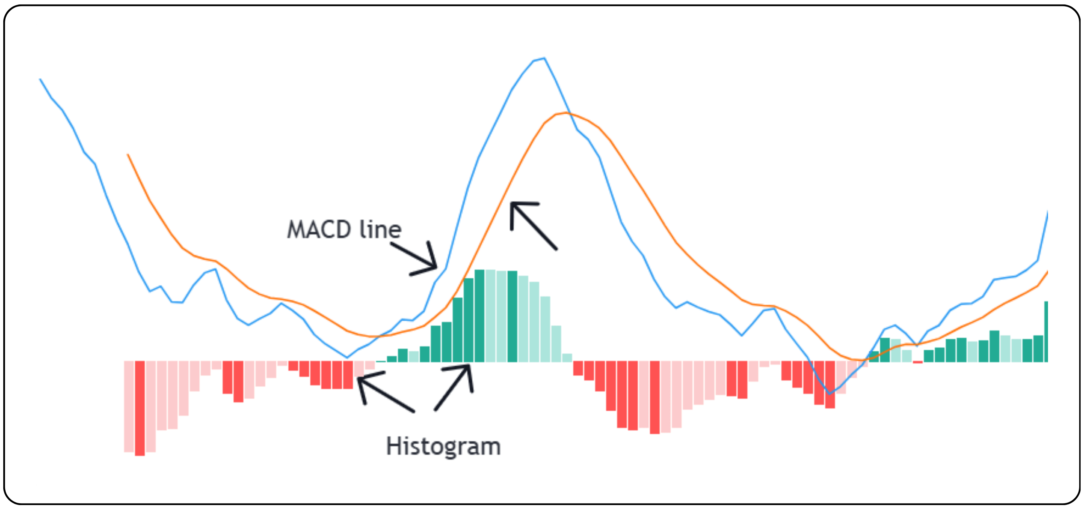
MACD is a trend-following momentum indicator that shows the relationship between two moving averages of a security's price. It is calculated by subtracting the 26-period Exponential Moving Average (EMA) from the 12-period EMA. The result is the MACD line. A 9-period EMA of the MACD line, known as the signal line, is then plotted on top to generate trading signals. Traders use this combination to spot possible buy or sell opportunities based on changes in momentum.
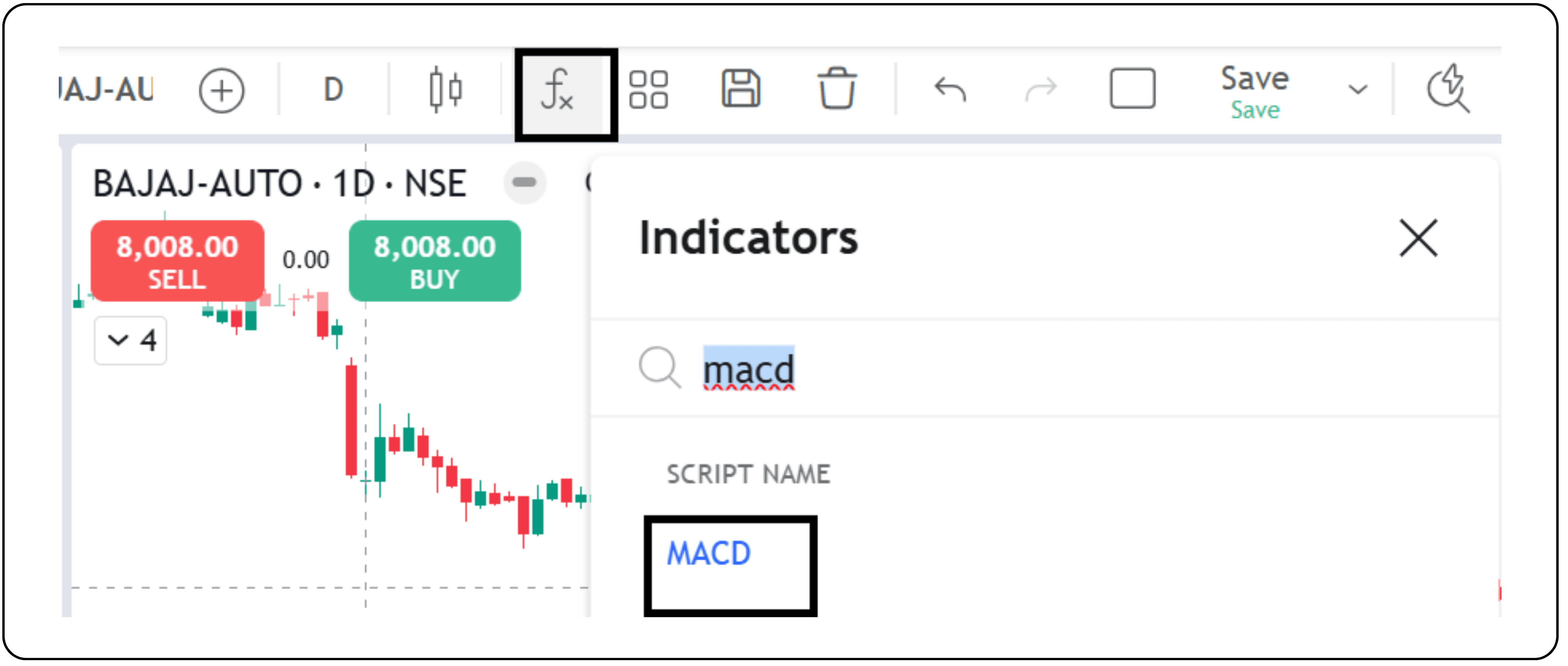
Where to find and how to apply the MACD indicator
Log in to CubePlus, go to the Indicators section, and search for MACD. Applying this indicator to your chart will help you identify the market trends more effectively. In the article below, we will discuss the MACD indicator in detail, including how it works and how to use it in your trading strategy.
The image below displays the MACD line, the Signal line, and the Histogram.
For swing trading or long-term holding, daily and weekly time frames are advisable, and for intraday trading, using 15-minute to 30-minute time frames is recommended, as they help capture shorter-term momentum while avoiding excessive noise.
How crossover signals help spot trend shifts early
One of the most common uses of MACD is through crossover signals. The MACD line and the signal line interact in ways that suggest when momentum is changing. When the MACD line crosses above the signal line, it is generally seen as a bullish signal or is said to be an MACD buy signal, hinting at a possible upward move. When the MACD line crosses below the signal line, it is considered bearish and could indicate a potential sell opportunity. These crossovers are often used to identify entry and exit points, especially during trending markets.
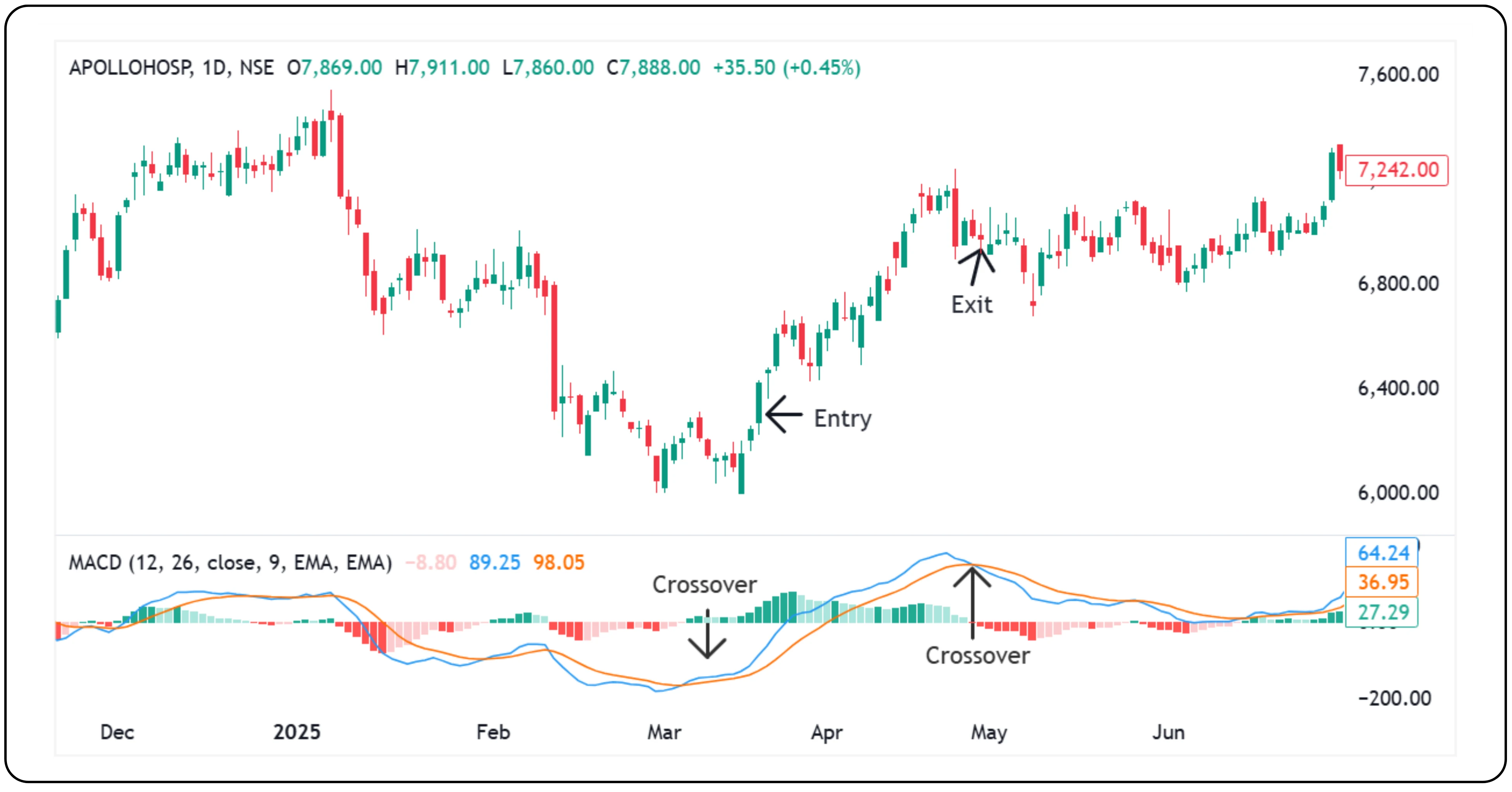
Real example: Apollo Hospitals, March 19, 2025
On March 19, 2025, the MACD indicator for Apollo Hospitals signaled a potential trend reversal. The MACD line (blue) crossed above the Signal line (orange), which is a commonly used bullish signal. This crossover indicated a shift in momentum from bearish to bullish. Supporting this, the histogram also turned green, reflecting strengthening upward momentum. These combined signals suggested a potential entry point into the stock.
The uptrend continued until early May when the Signal line crossed back above the MACD line, hinting at weakening momentum. For traders using the MACD strategy, this crossover served as a potential exit signal.
Divergences as a clue to potential reversals
Another insightful use of MACD is to watch for divergences. A divergence occurs when the price movement of a stock disagrees with the movement of the MACD line. A bearish divergence forms when the price is making higher highs, but the MACD is making lower highs. This may suggest that the upward momentum is weakening and a downward reversal could be approaching. On the other hand, a bullish divergence appears when the price is making lower lows, while the MACD is making higher lows, hinting at a possible trend reversal to the upside. These divergences serve as a warning that the current trend may not be sustainable.
The moving average convergence divergence indicator is especially helpful in identifying such divergences early. By tracking momentum shifts, traders can use the MACD indicator to gain a clearer picture of whether a trend is likely to continue or reverse. Whether you are trading short-term or long-term, the MACD remains one of the most popular tools in technical analysis for timing entries and exits.
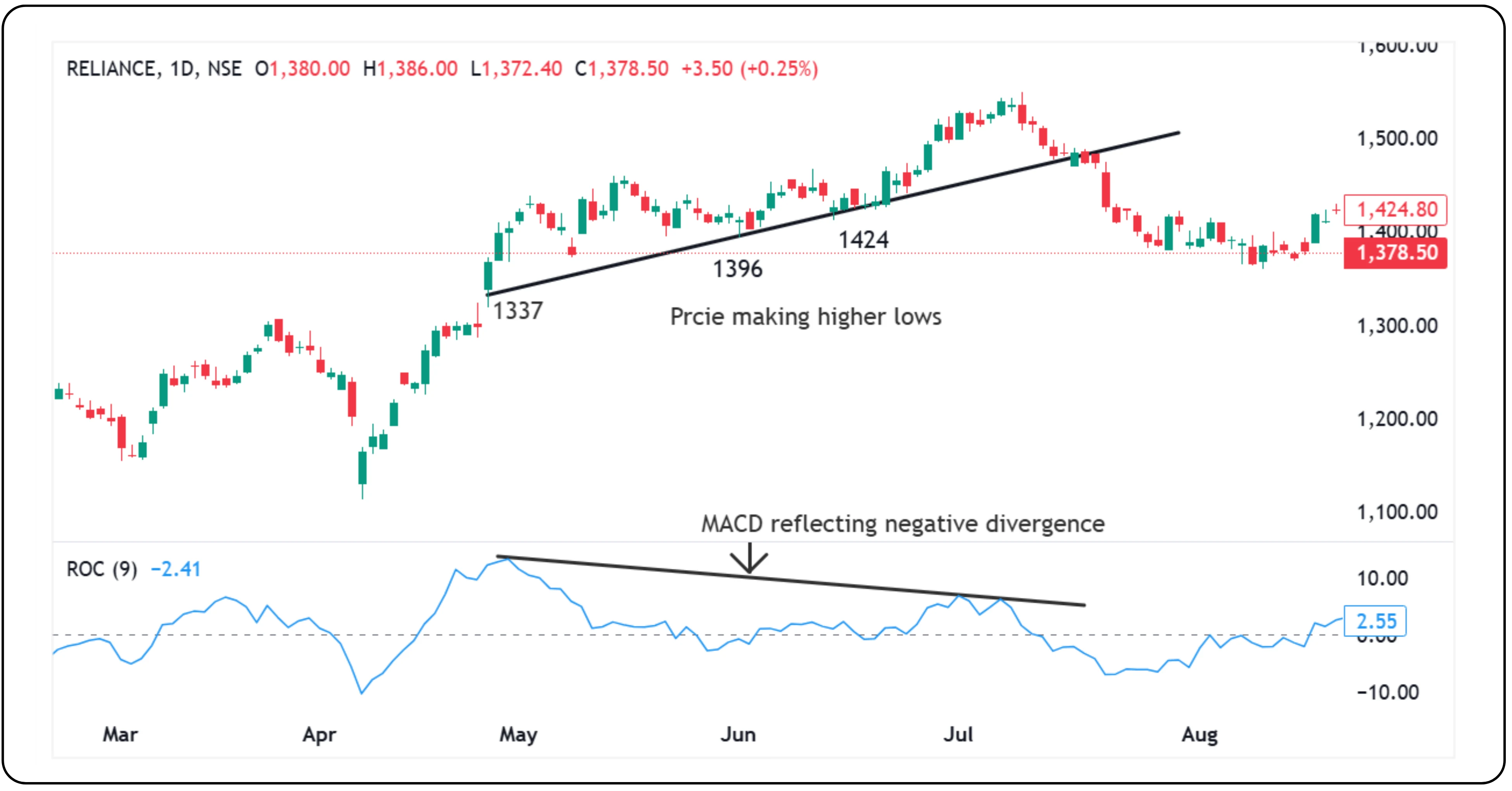
In the case of Reliance, the MACD indicator showed a clear negative divergence between 30th April 2025 and 7th July 2025. During this period, while the price continued making higher highs, the MACD line was trending downward. This divergence signaled weakening momentum, suggesting that a trend reversal could be on the way. As the chart shows, after 18th July 2025, the stock price began to decline. This setup helped traders with an opportunity to exit early or a potential short setup for those anticipating a shift in trend.
Using MACD to identify overbought and oversold zones
MACD can also be a helpful guide for detecting when a stock is possibly overbought or oversold. This happens when the shorter-term moving average pulls far away from the longer-term average. A steep rise in the MACD line often signals that the price has moved too quickly and could be due for a pullback. This is not a precise timing signal but offers a cue that the price trend might be overextended and a correction could follow.
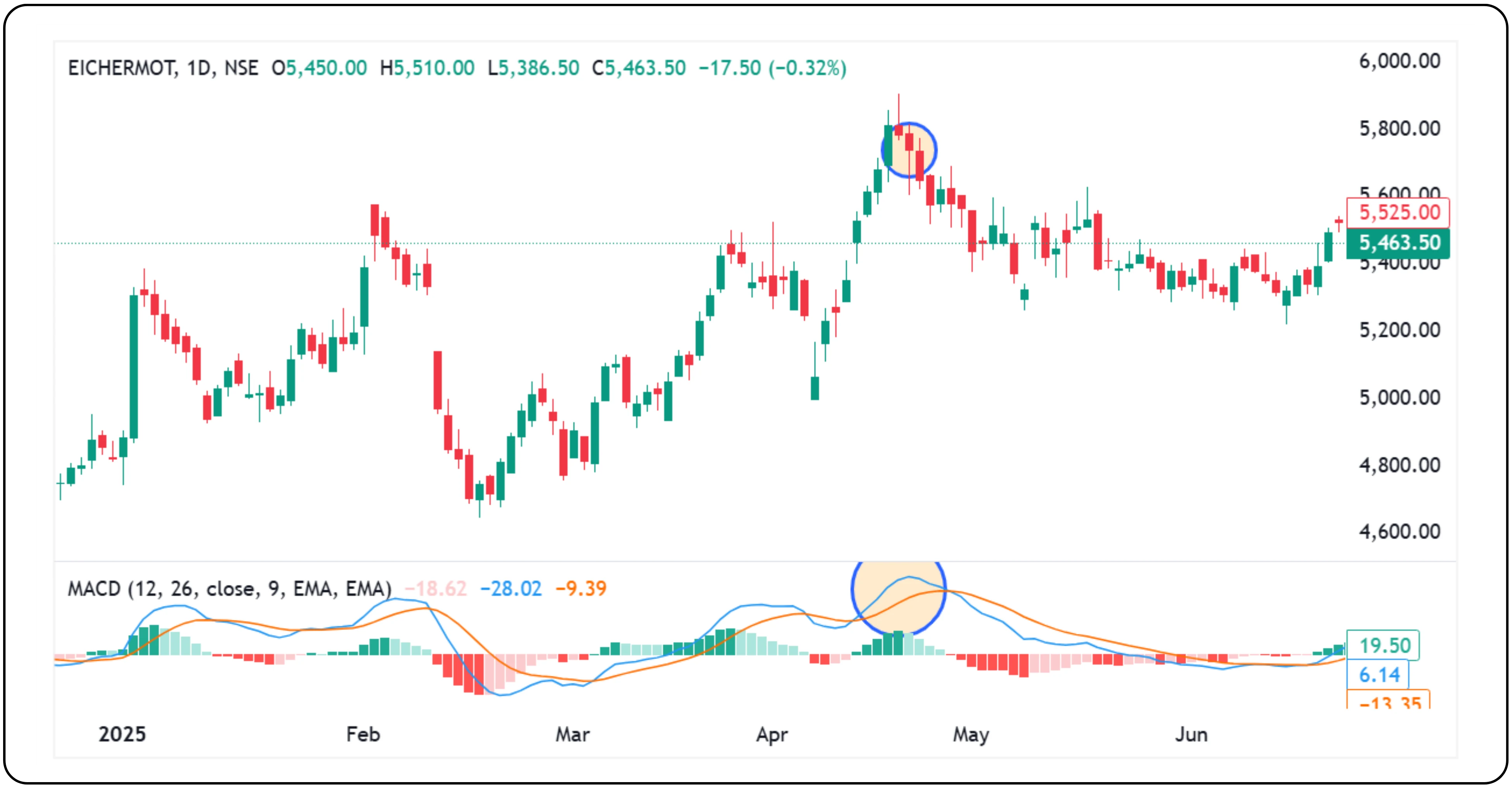
In the case of Eicher Motors, the MACD indicator showed a sharp rise in the last week of April 2025. The MACD line pulled significantly away from the signal line, creating a wide gap. This price has risen too quickly and may be entering an overbought zone. As seen on the chart, a minor pullback followed soon after. While this is not an exact timing tool, such steep movements can act as early signs that a short-term correction may be likely.
Using the MACD histogram as an early warning for momentum shifts
Some traders rely on the MACD histogram to gauge the strength of a trend. The histogram visually represents the difference between the MACD line and the signal line. When the histogram bars are large, it indicates strong momentum in the current direction. However, if the bars begin to shrink, even before a crossover happens, it could signal that momentum is weakening. Traders sometimes use this as an early-exit strategy, choosing to reduce or close their positions when the histogram starts declining from its peak. This approach helps manage risk more effectively by responding to fading strength before a full trend reversal occurs.
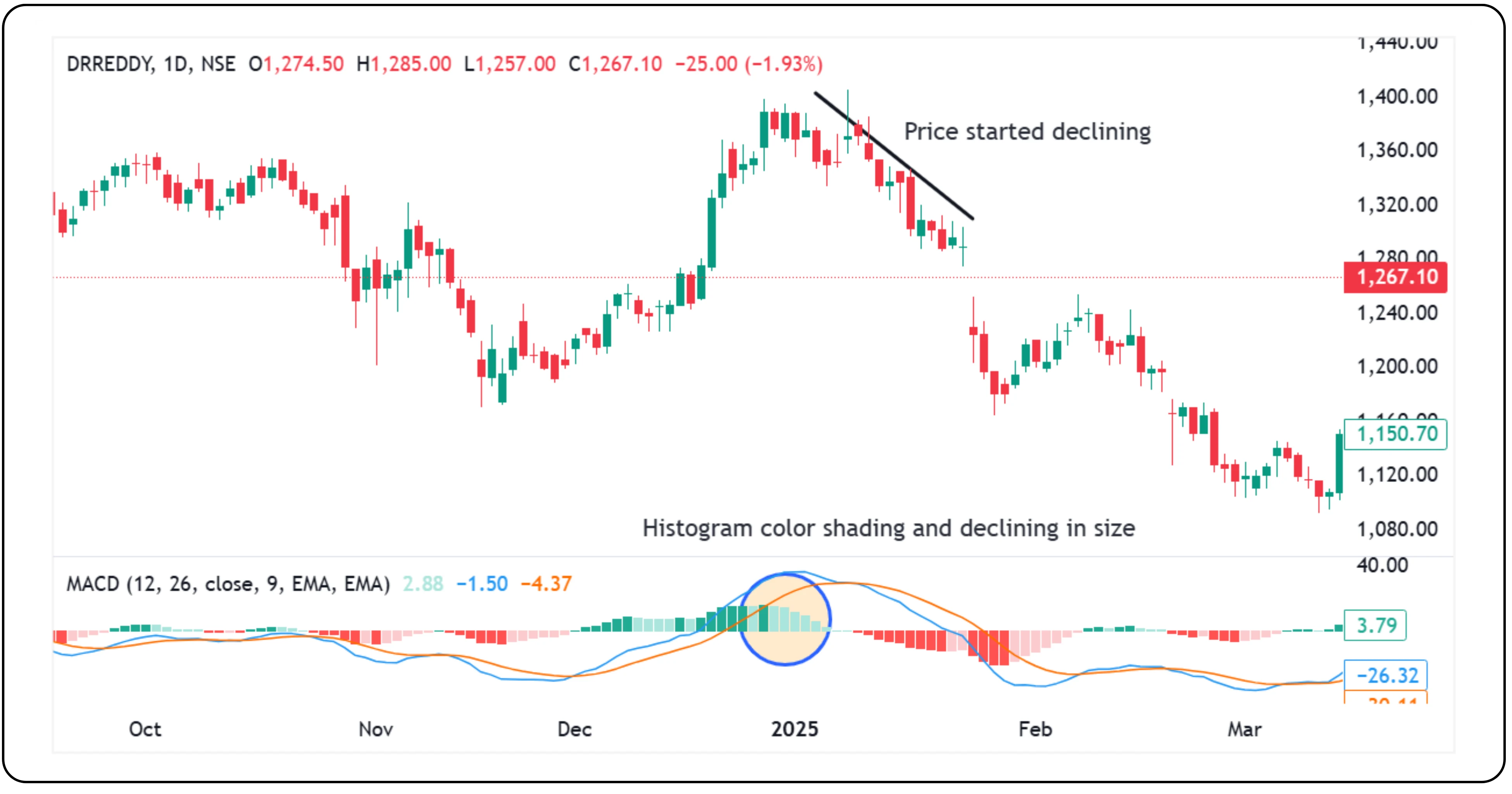
Dr. Reddy’s chart showed the stock was in a strong uptrend from 21st November 2024. However, around 30th December 2024, the MACD histogram began to fade in color and gradually shrink in size. This signaled a weakening in momentum, even though the MACD line had not yet crossed below the signal line. This early shift in the histogram hinted at a possible loss of strength in the uptrend and an upcoming price drop. It shows how the histogram alone can sometimes offer an early clue about a trend reversal, before the MACD crossover happens.
Popular MACD settings used by different trader profiles
The original MACD settings introduced by Gerald Appel use the 12 and 26-day exponential moving averages along with a 9-day signal line. However, traders also experiment with alternate combinations such as 8, 17, 9, or even 3, 6, 9, depending on their time horizon and trading style. Faster settings can help detect short-term momentum changes, while the original configuration offers a more balanced view.
MACD as a dynamic momentum indicator, not a standalone solution
While MACD provides valuable insights into trend direction, momentum, and reversal points, it works best when used alongside other tools such as volume analysis, price patterns, or support and resistance levels. MACD does not predict future price movements, but gives a structured way to interpret what price and momentum are doing right now. For traders looking to stay on the right side of the trend or exit before it fades, MACD offers clear visual cues backed by simple logic.
Disclaimer: The information provided in our blogs is for informational purposes only and should not be construed as financial, investment, or trading advice. Trading and investing in the securities market carries risk. Always conduct your own research and consult with a qualified financial advisor before making any investment decisions. Past performance is not indicative of future results. Copyrighted and original content for your trading and investing needs.
© 2025 — Tradejini. All Rights Reserved.


