


If you are a complete beginner in stock trading or investing, you have likely heard the term trendline enough times it sounds familiar. But what is it? And even more so, how does one correctly draw it?
In this article, we will explain it as simply as possible. If you are a total newbie or are looking to refresh your charting skills, knowing how to draw a trendline correctly is going to be one of your greatest assets for technical analysis.
What is a trendline
A trendline is a straight line drawn on a chart that connects two or more price points. It helps in identifying the direction of the market, whether it is going up, down, or moving sideways.
A trendline acts like a visual guide. It shows where the price has been respecting a particular level repeatedly, like a support during an uptrend or resistance in a downtrend.
Think of it like this. If the price is bouncing off a rising support line multiple times, that is a clue that buyers are active near that level. Similarly, in a downtrend, sellers often step in near the resistance line. This is where trendline in trading comes into play. It is a basic but powerful concept in chart reading. Technical analysis trend lines help traders spot potential support and resistance zones, making it easier to follow the market’s direction and plan entries or exits with more confidence.
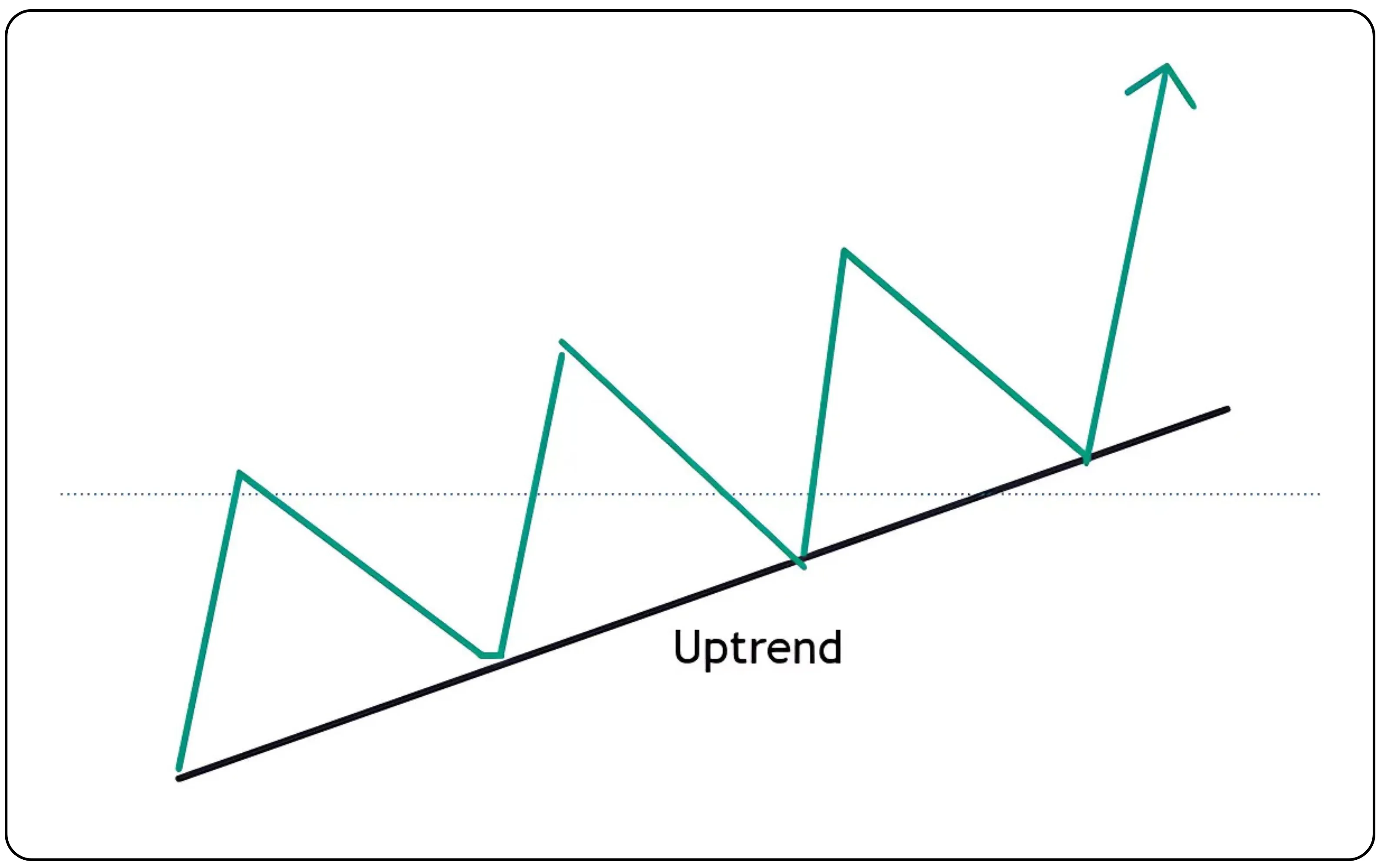
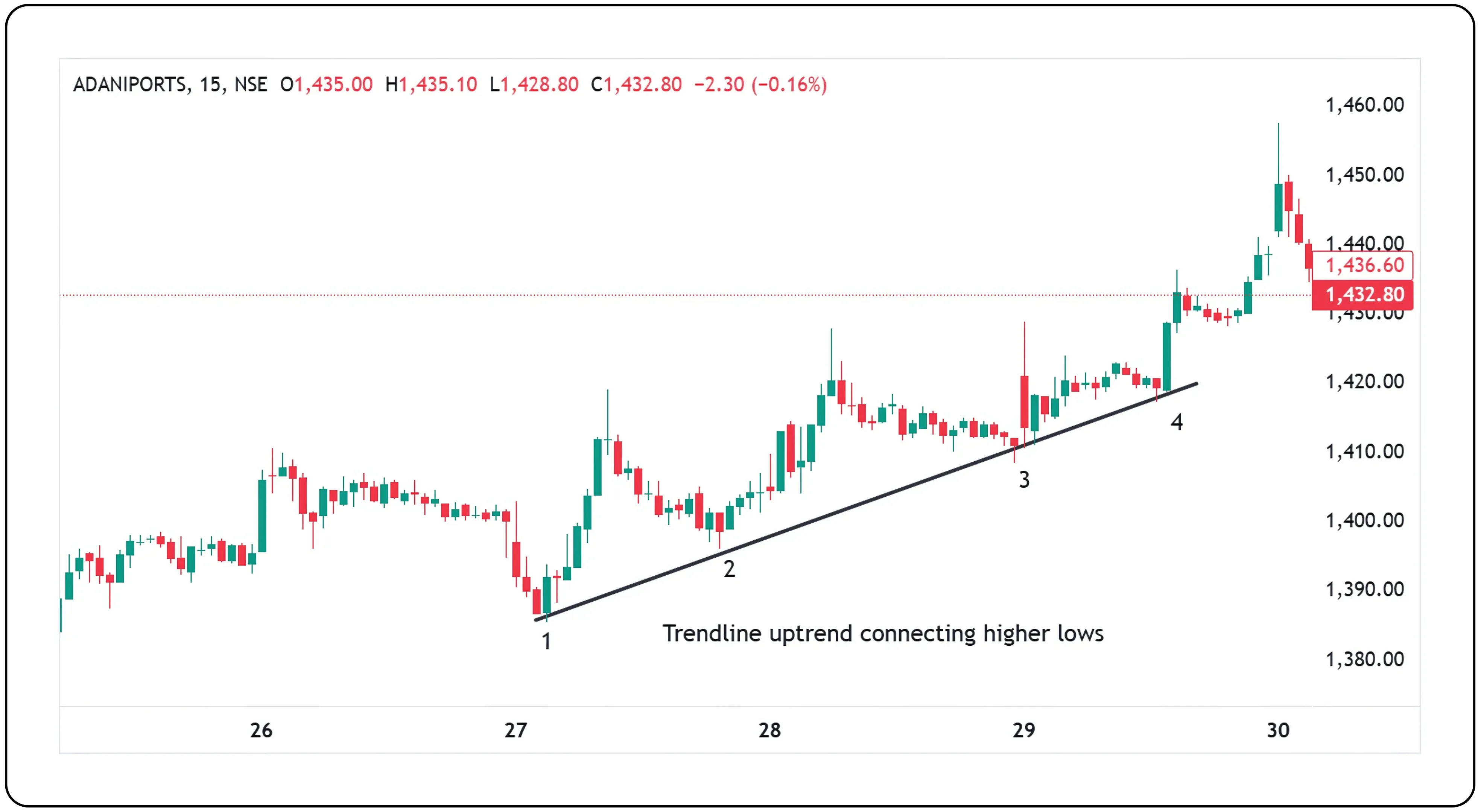
How to draw a correct uptrend line
Let us say a stock is moving up, and you want to draw an upward trendline. Here is how you should do it:
Identify at least two higher lows on the chart. These are the price points where the market forms bottoms that are progressively moving higher over time.
Open the drawing tool on your charting platform. If you are using CubePlus, you can access the drawing tool from the chart toolbar.
Connect the higher lows using a straight trendline. This line helps you visually confirm an upward trend and serves as potential support in future price action.
Finally, wait for a third touch to confirm the validity of the trendline.
Important reminder. Never draw an uptrend line by connecting the higher highs. That is incorrect and misleading. Higher highs should be used with a parallel channel, not with a single trendline.
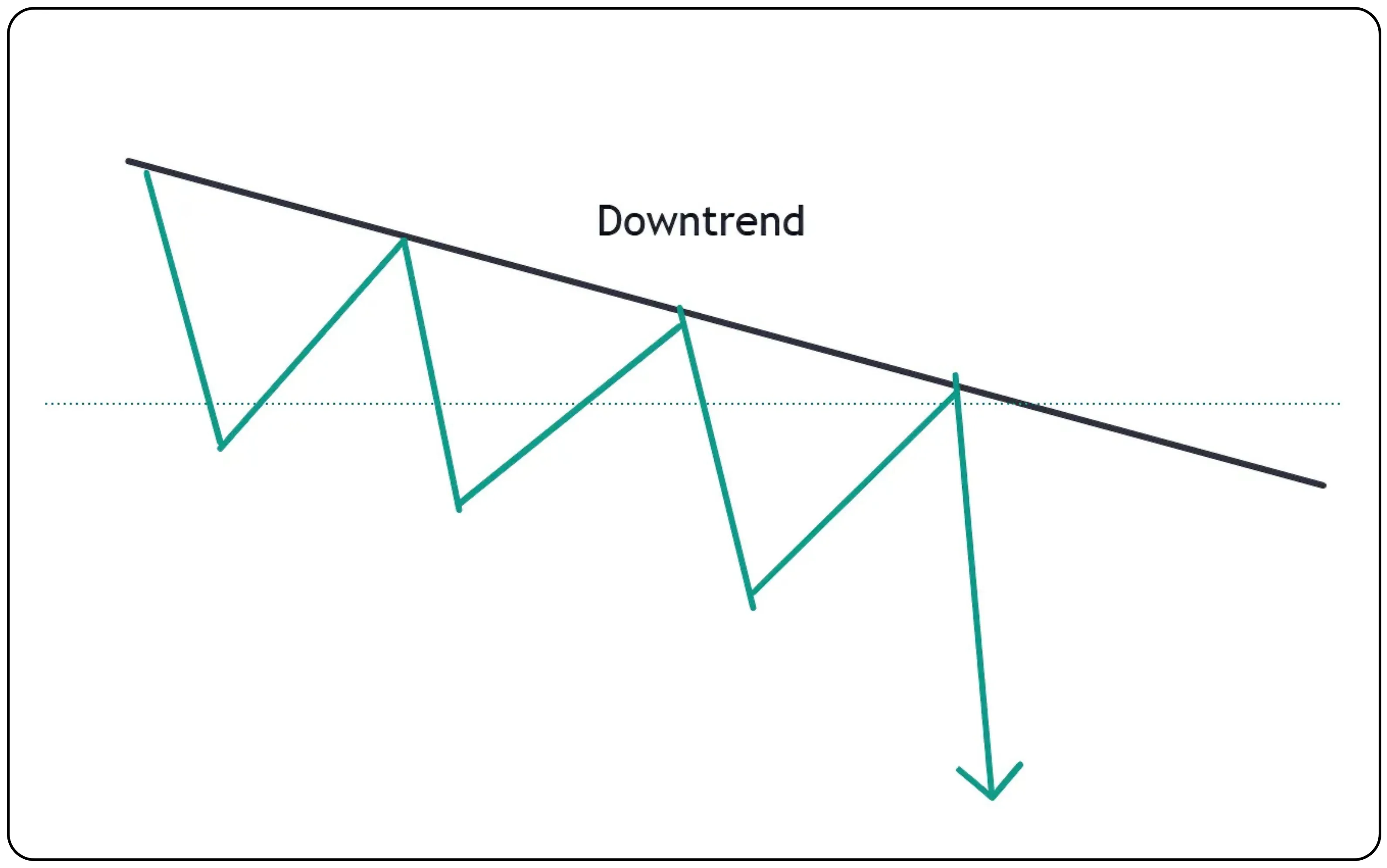
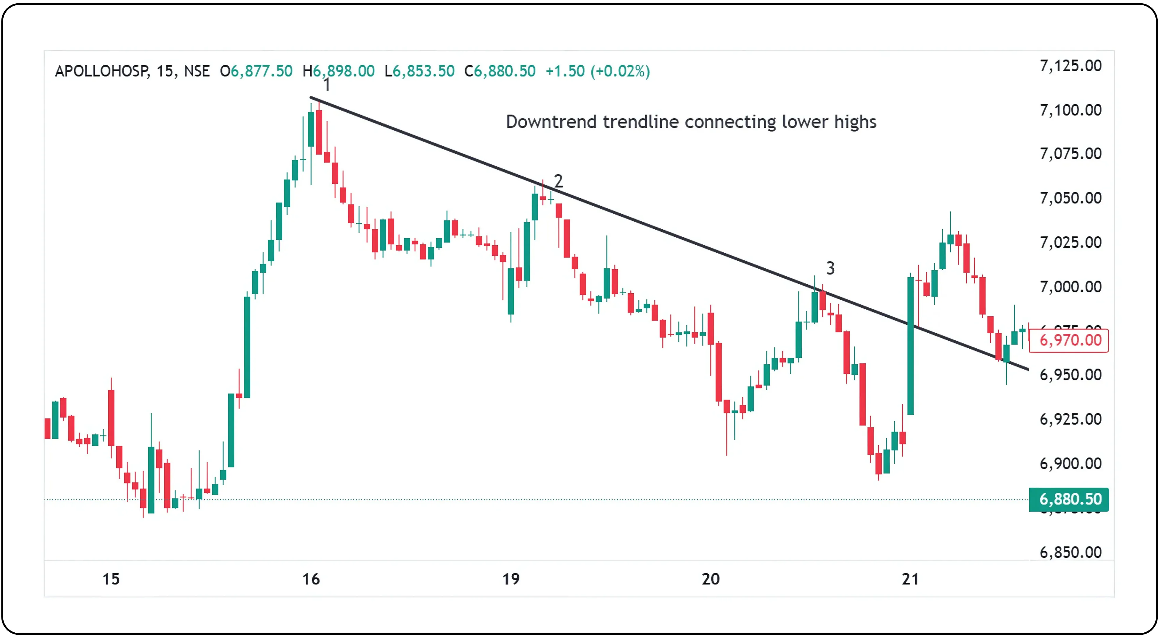
How to draw a correct downtrend line
Now let us look at the opposite situation. Suppose a stock is falling. You can draw a downward trendline like this:
Identify at least two lower highs on the chart. These are the points where the price tries to move higher but fails and turns down, forming progressively lower peaks.
Connect the lower highs using a straight trendline. This helps you mark a clear descending resistance line.
Wait for a third touch point on the trendline. A third rejection from this line adds confirmation and strength to your trendline analysis.
Again, do not connect lower lows to draw a downtrend line. That is incorrect. Use a parallel channel if you want to include both lower highs and lower lows.
Also read: Spent or Saved? What I Did with My First Stipend
Why you need three touch points, not just two
Many people think that just connecting two points is enough. Yes, in geometry that is true. But in trading, two points are not enough. A trendline becomes reliable only when the price touches it a third time and respects it.
Until then, the line is just a guess.
For example, if a stock bounces off a line twice and the third time it also respects it, the trendline gains credibility. Now traders can confidently use it to plan trades, like buying near the support or selling near the resistance.
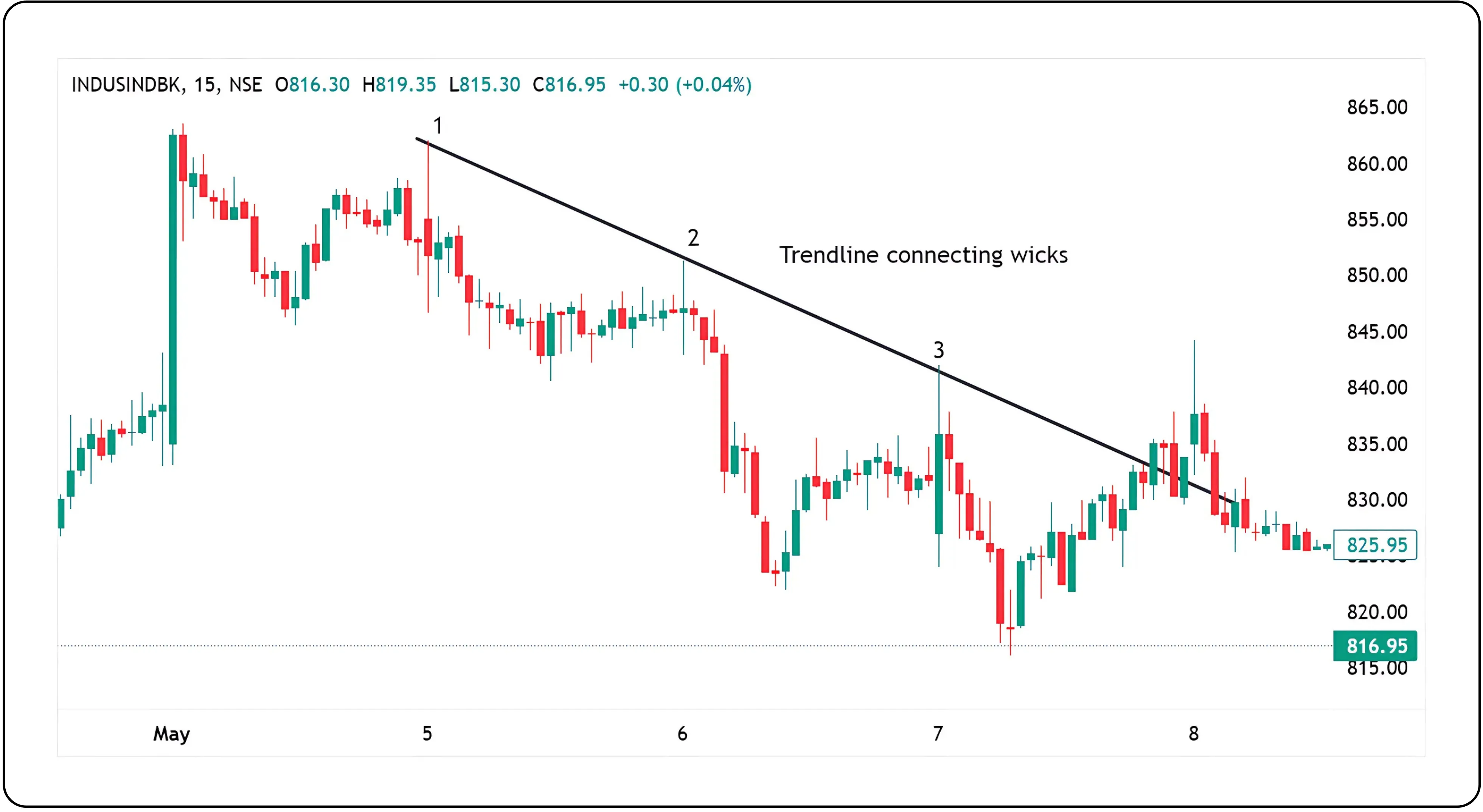
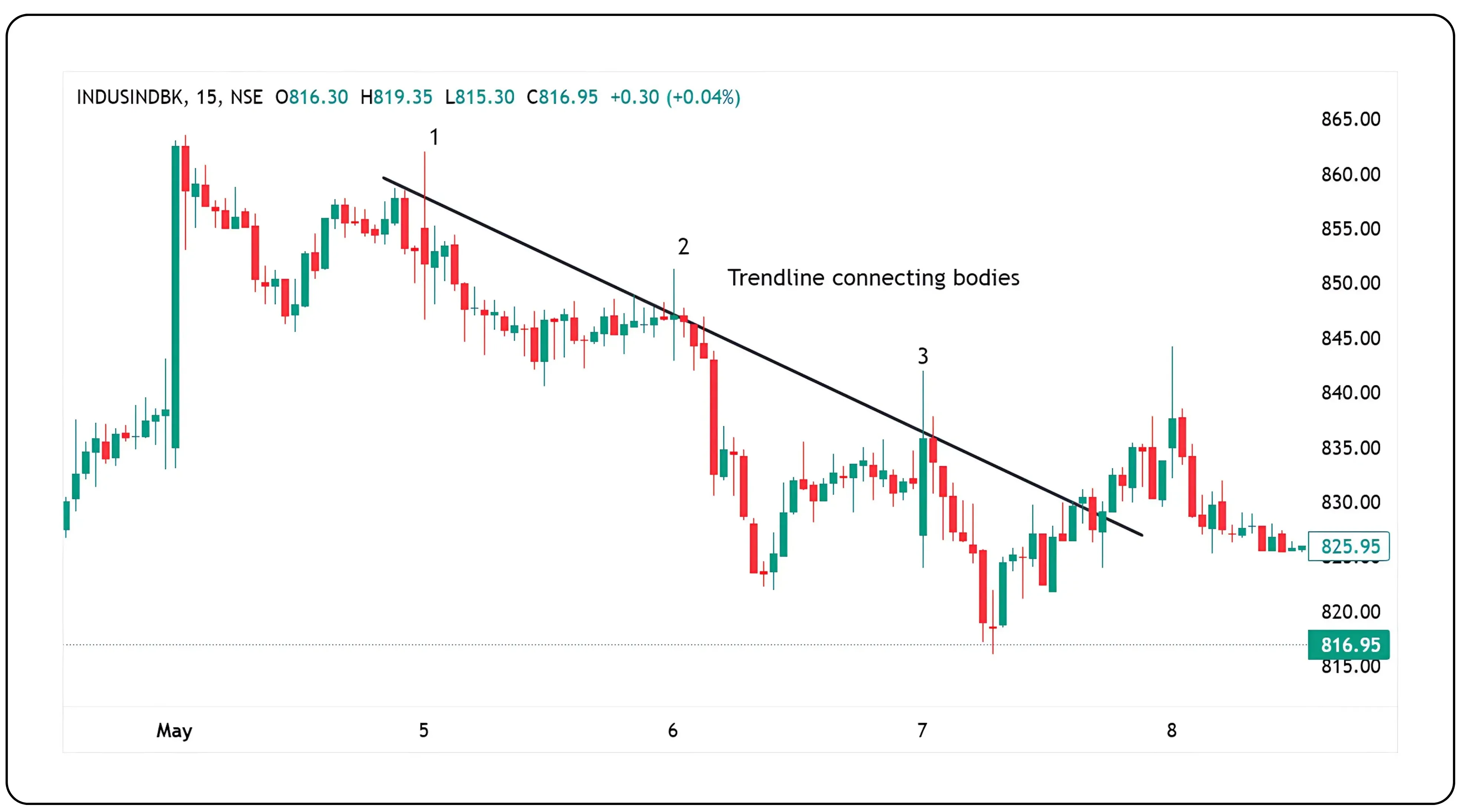
Wicks versus bodies in trendline drawing
This is another area where people often get confused.
When you look at a candlestick chart, you will see wicks and bodies.
Some traders prefer connecting wicks, especially if they are drawing support or resistance levels. Others prefer using bodies, especially if they believe bodies represent actual closing prices.
The key is consistency. If you start connecting wicks, continue with that method. Do not mix wicks and bodies within the same trendline. That will create confusion and generate false signals.
Choosing the right time frame
Trendlines behave differently across time frames. This is very important.
A trendline on a daily chart is much stronger than one on a five-minute chart.
If you are scalping or intraday trading, you might use five-minute or fifteen-minute timeframes.
For swing trading, you can go with one-hour or daily charts.
Make sure you draw trendlines that match your trading style. Do not blindly use a three-minute trendline if you are a positional trader. That will only confuse your entries and exits.
Recap: Steps on how to draw a proper trendline.
Select the appropriate time frame, Identify at least swing lows for uptrend or two swing highs for down trend.
Use the drawing tool located on your platform.
Get in the habit of drawing the points consistently with wicks or body.
Wait for the third touch to confirm the trendline. (Do not connect highs in the uptrend or lows in the downtrend).
Technical significance and strategic edge
Drawing trendlines might seem simple, but it requires practice and precision. The more you do it, the better you get at spotting genuine market structures. Think of trendlines as the framework of price movement. They help bring clarity when the market looks chaotic.
In the next part of our trendline series, we will show you how to use trendlines for entry and exit decisions, and how to combine them with indicators like RSI or MACD.
Disclaimer: The information provided in our blogs is for informational purposes only and should not be construed as financial, investment, or trading advice. Trading and investing in the securities market carries risk. Always conduct your own research and consult with a qualified financial advisor before making any investment decisions. Past performance is not indicative of future results. Copyrighted and original content for your trading and investing needs.
© 2025 — Tradejini. All Rights Reserved.