


Support and resistance work like sturdy boards that price keeps bumping into. They are those invisible barriers on a price chart where the action often pauses, turns around, or breaks through, giving traders clues about what might happen next. To really understand this, it helps to know that support and resistance in the stock market are not just lines on a chart.
They actually reflect human behavior, showing how fear, hope, and habits play out in buying and selling. When a stock keeps falling to a certain point but never goes lower, that is support in action. When it keeps rising but struggles to cross a certain level, that is resistance. Mastering these levels helps traders and investors plan smarter entries, exits, and stops with more confidence.
Why prices stall or reverse
Let us look at a quick story. Suppose Investor X bought shares of XYZ Company while the stock was rising, and he was thrilled to see his investment grow. But soon, heavy selling came in, and the stock price started to fall. Worried about losses, X decided he would wait until the price came back to the level where he bought it. This is where support comes into play. That level where X hopes the price will bounce back is nothing but a support zone.
Many new investors do the same thing. They panic-sell at a certain level, and that price becomes what traders call overhead resistance. It works like a ceiling because the next time the price climbs back up to that level, people remember their vow to sell, so selling pressure builds up there again.
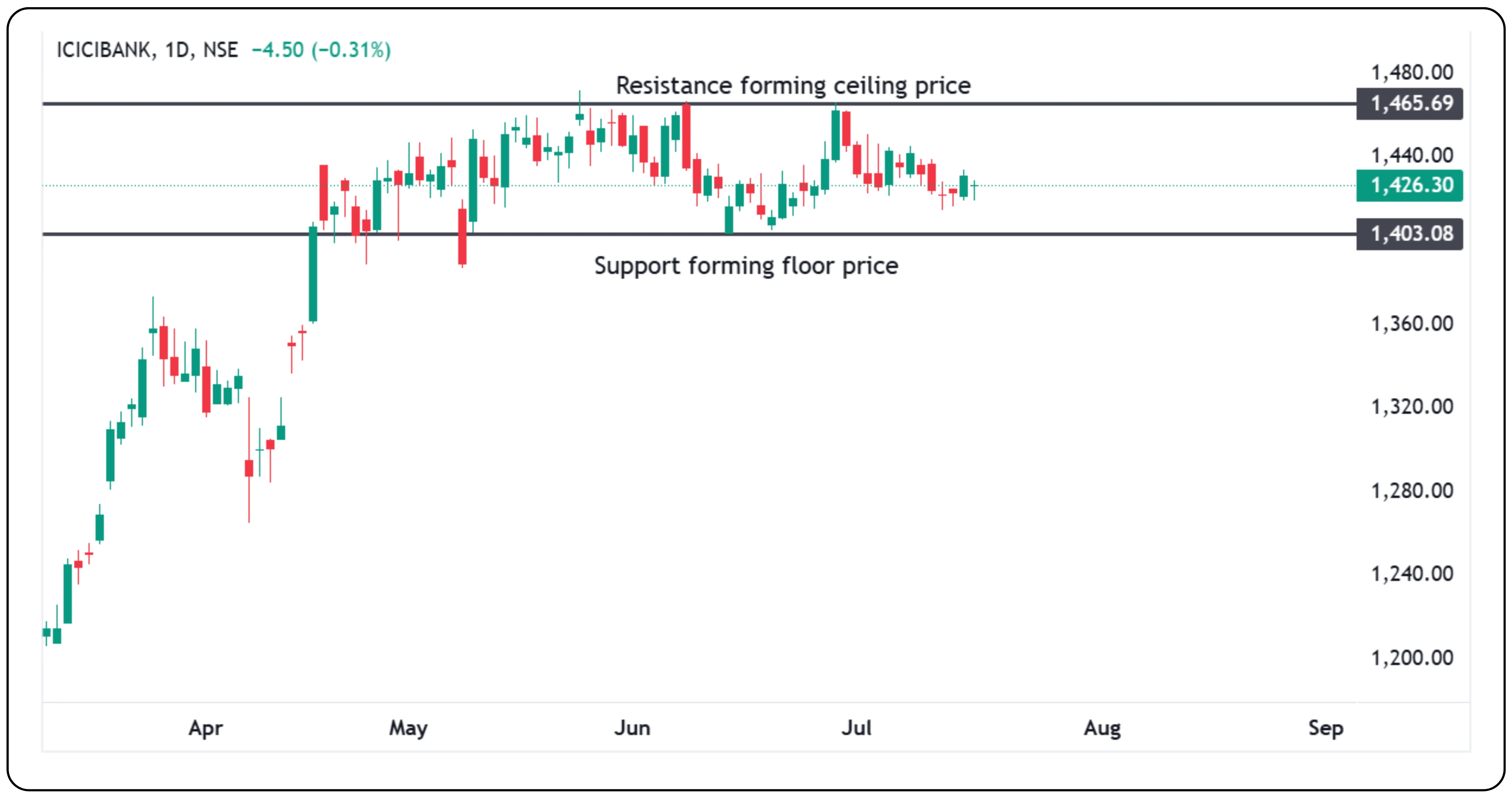
Also, it is important to remember that resistance level and support level are not just single price points. Drawing just one exact line often does not capture the full picture. Sometimes, prices dip a few points below or above, and wicks from a few candles form around those areas. So, consider marking a small zone, maybe 5 points up or down, instead of just a line. This can help you avoid jumping into a trade too early or exiting in a panic.
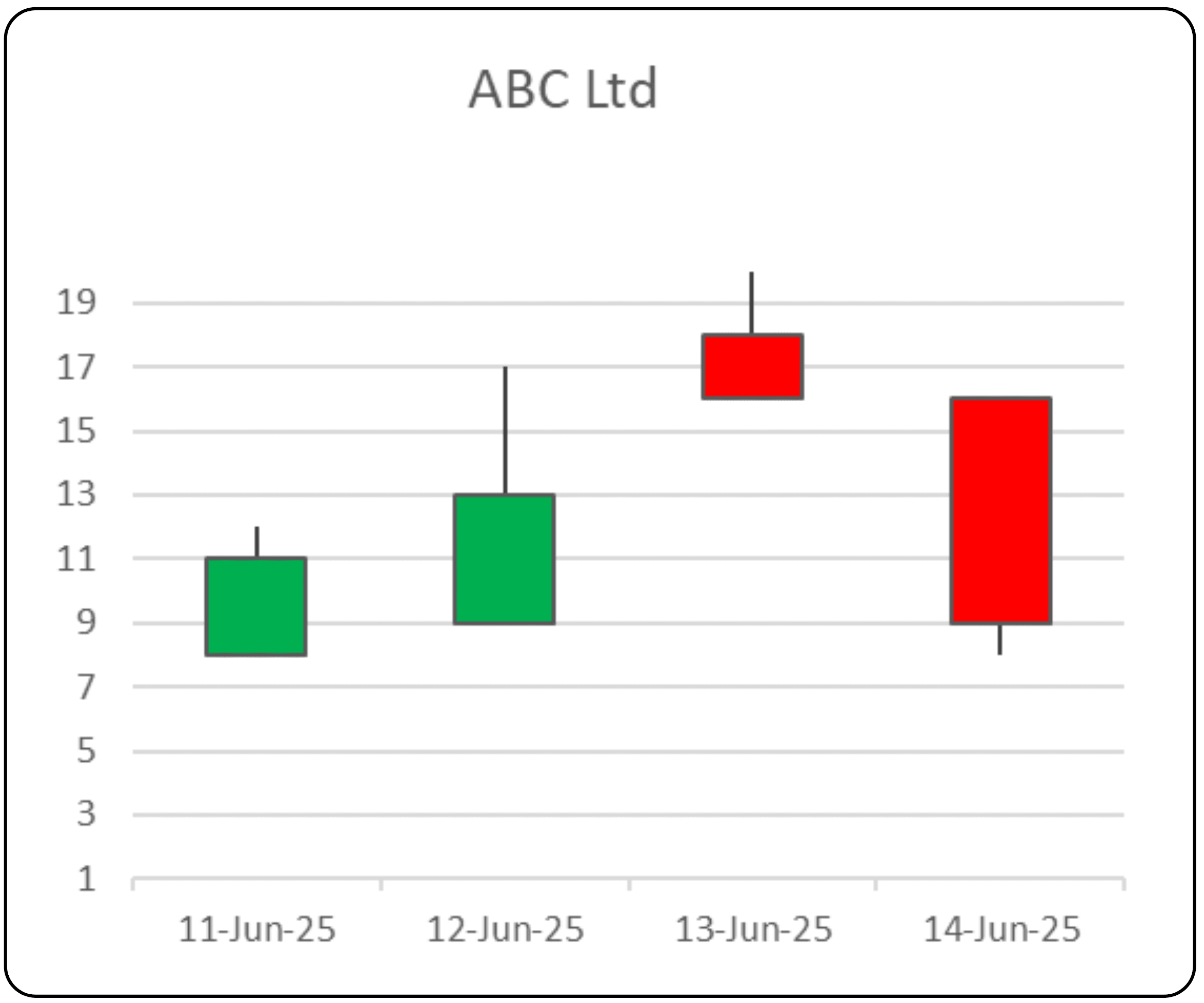
The same thing happens in reverse with support. Imagine someone misses buying a stock of ABC Ltd at ₹10, only when they see it jump up to ₹20. They plan to buy it if it ever comes back down to ₹10. When it does, they go ahead, and others jump in to buy at that ‘cheap’ level, creating a floor that props up the price.
Of course, these floors and ceilings are not made of concrete. Price can still break through if the pressure is strong enough.
Where do you spot Support and Resistance?
The good news is that there are several ways traders can find these levels on a chart. Let us look at some of the more common ones:
1. Flipping role of trendline
Trendlines are simple sloping lines that connect a series of highs or lows. A rising trendline often acts like support, so the price bounces off it as it climbs. But if the price breaks below, that same line can act like resistance in the future.
Imagine a rising trendline that connects three or four valleys. If the price pierces through it, that same line might later block the price from climbing back up past it. So, a support line can become a resistance line and vice versa.
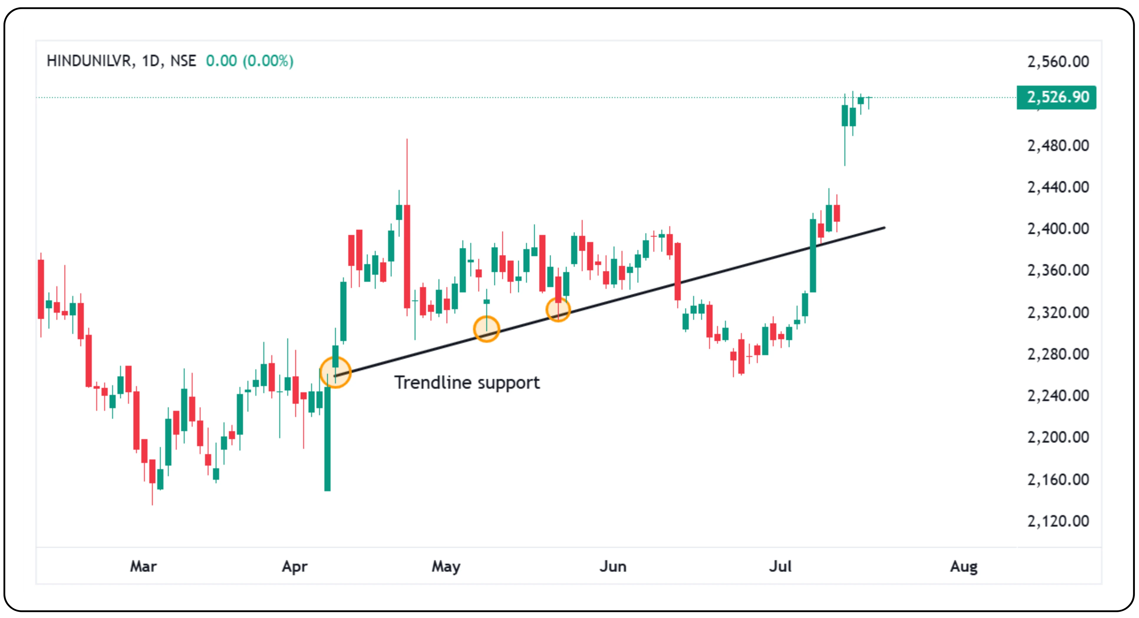
The chart of HINDUNILVR shows how the price initially took support on a trendline, then broke below it around 12th June 2025, turning that support into resistance. However, by 7th July 2025, the price broke above the same trendline resistance, triggering a fresh rally.
2. Price gaps, the unreliable cousins
Sometimes, prices jump so quickly that they leave a gap on the chart, which is a blank space between yesterday’s high and today’s low (or the other way around). Some traders watch these gaps as possible support or resistance spots. But they do not always hold up well.
While gaps can sometimes pause or reverse price, they do not work consistently enough to rely on alone.
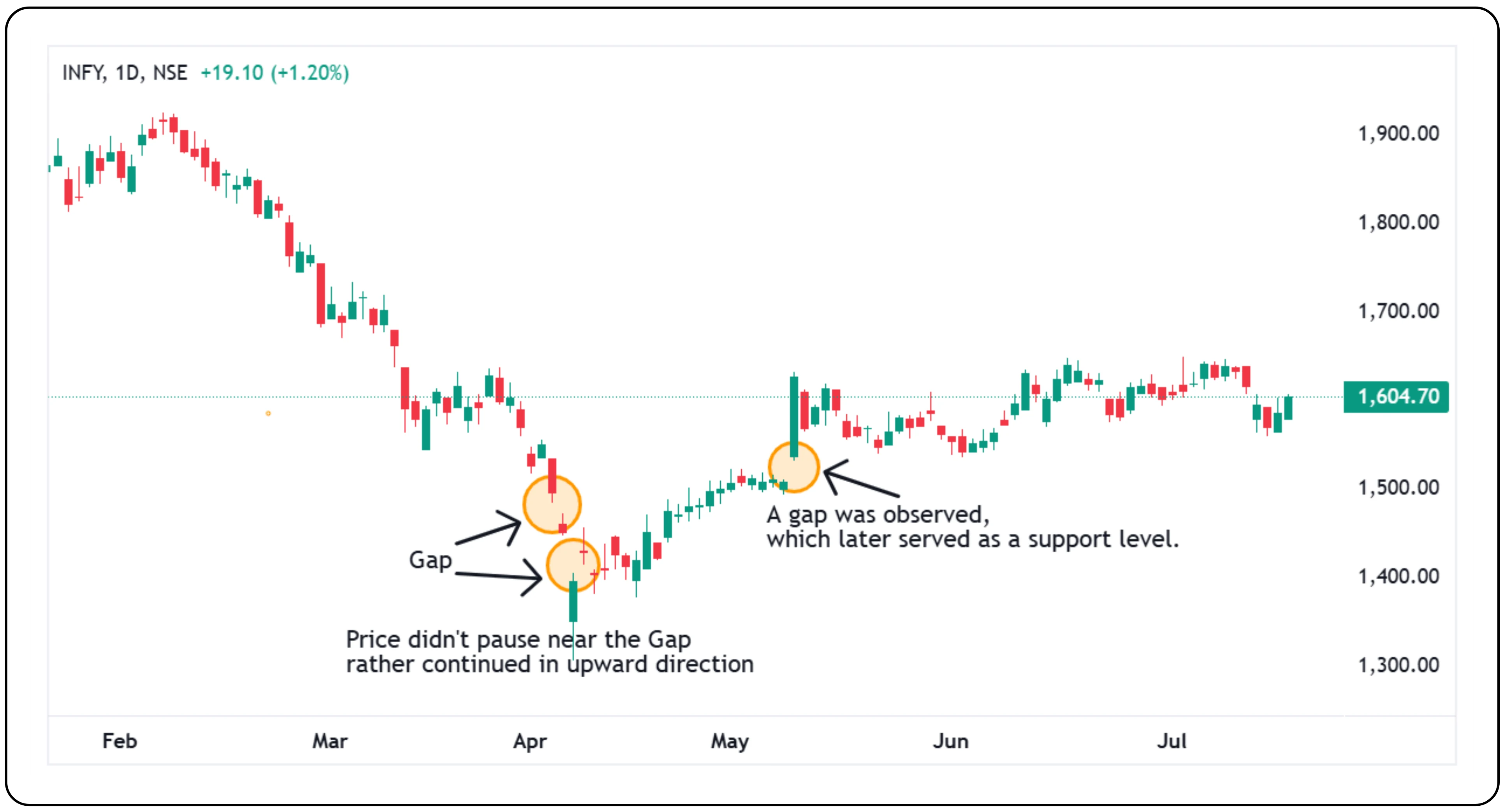
On the INFY chart, during the downtrend phase (pre-April 2025), we can observe a classic continuation gap, supporting the bearish momentum. However, in April, the trend started to shift gradually as the price began moving upward. On 12th May 2025, a noticeable gap-up occurred, which remains unfilled to date. This unfilled gap suggests a reversal in sentiment. Instead of acting as a continuation signal, the gap has now reversed direction and serves as a potential support area. The price is now consolidating above that level, showing that not all gaps behave reliably, especially when market sentiment shifts.
3. Horizontal consolidation regions (HCRs)
This one might sound fancy, but it is simple. Sometimes, prices stop trending and move sideways for a while, forming a block or box on the chart, often creating a rectangle pattern. This is called a horizontal consolidation region.
When the price moves sideways for a while, it means buyers and sellers agree on a fair value, creating a horizontal consolidation region. Later, when the price revisits this area, it often slows down or reverses because traders remember it as an important zone. The more times the price stays in or returns to this range, the stronger it becomes as a support (price floor) or resistance (price ceiling).
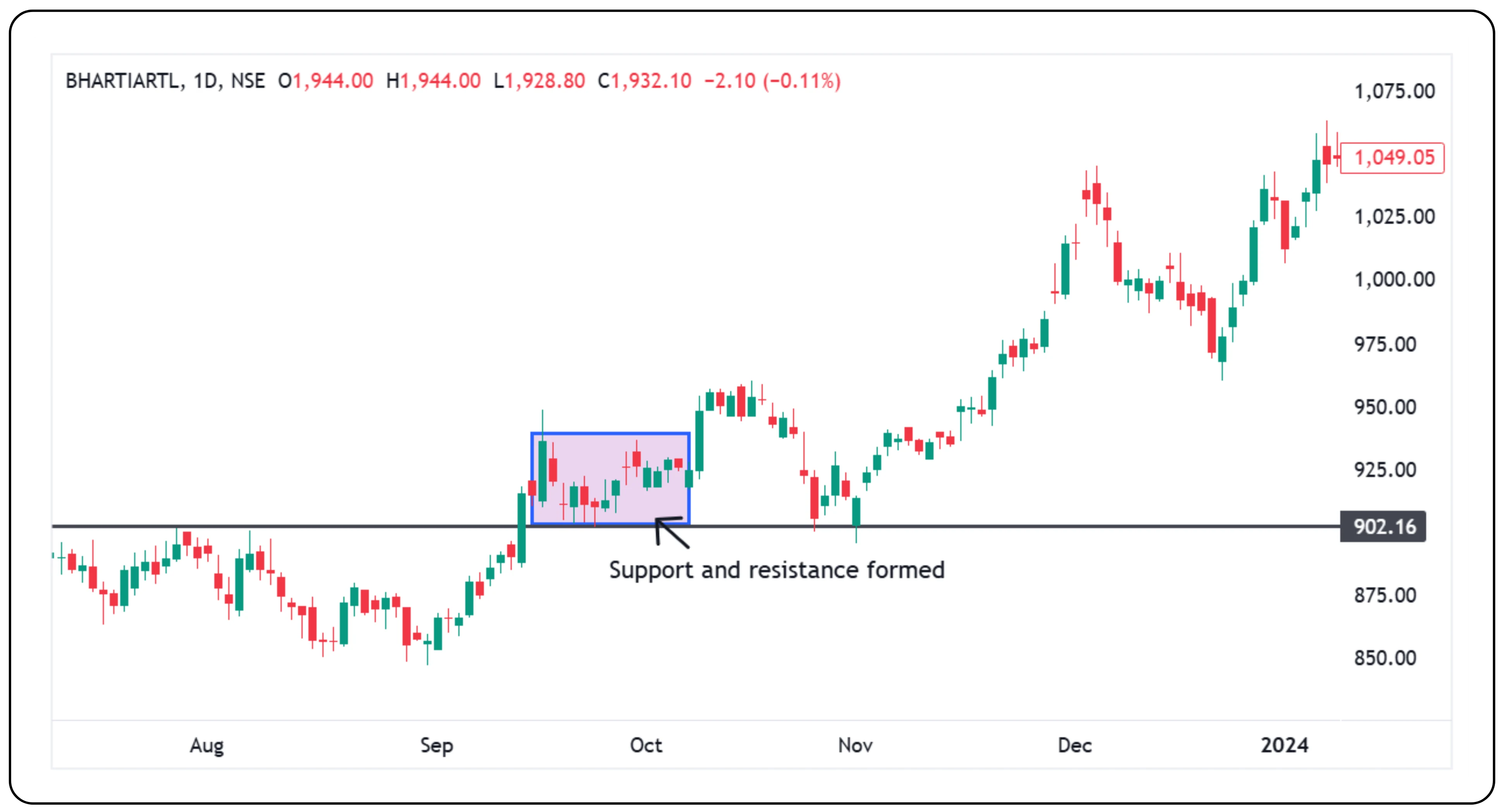
Bharti Airtel formed a clear support at ₹1,800 and faced resistance near ₹1,905 in month of April 2025. After multiple tests, it finally broke out above resistance with strong momentum, turning resistance into support. The price is now retesting that breakout zone.

On the Bharti Airtel chart, a rectangle pattern formed between 14th September 2023 to 9th October 2023, marking a clear support and resistance zone. After breaking out of this box, the price came back into the same zone a few days later. On 1st November 2023, it found support there again and bounced back up. This shows how the price often reacts when it returns to an old support and resistance area.
4. Peaks, Valleys, and Chart Patterns
Peaks and valleys on a chart show where strong buying or selling happened in the past, creating natural support and resistance levels. A previous high can stop prices from rising further, while an old low can stop them from falling. Chart patterns like triangles and rectangles connect these points, showing traders where the price might get stuck, pause, or break out with new strength. This helps plan better entries and exits.
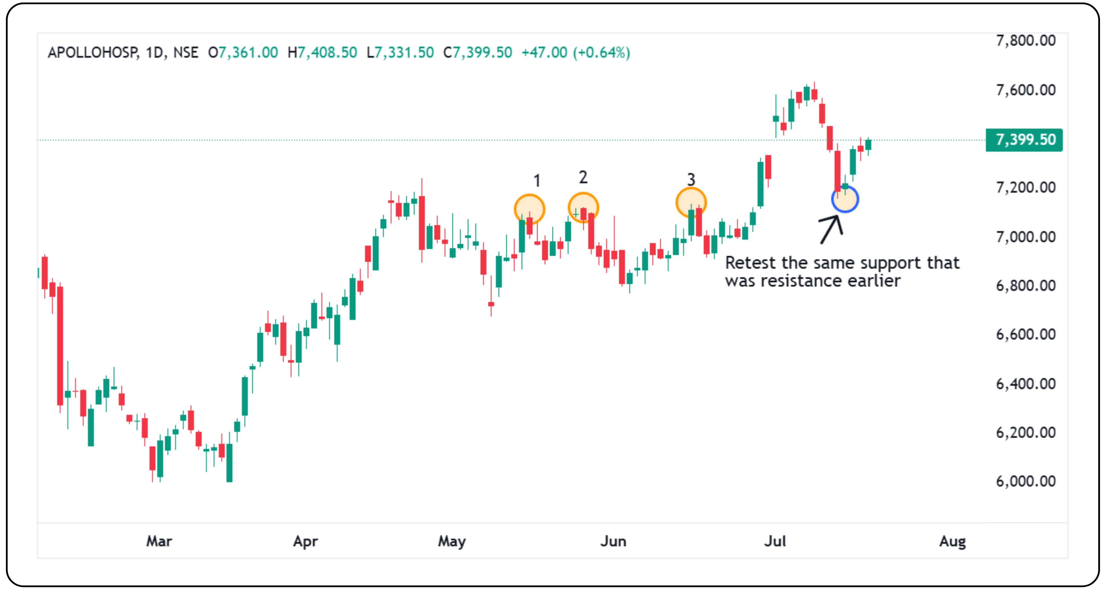
On Apollo’s chart, between 16th May 2025 and 17th June 2025, the stock showed three clear swings near the 7140 level. Each time it approached this zone, it faced resistance and pulled back. But eventually, it managed to break through. What is interesting is what happened next: after crossing that level, the stock came down again, and this time, the same 7140 level acted as support. It bounced back from there. This is a good example of how price swings help form support and resistance zones. A level that acts as a barrier on the way up can become a cushion on the way down, once the price breaks through it.
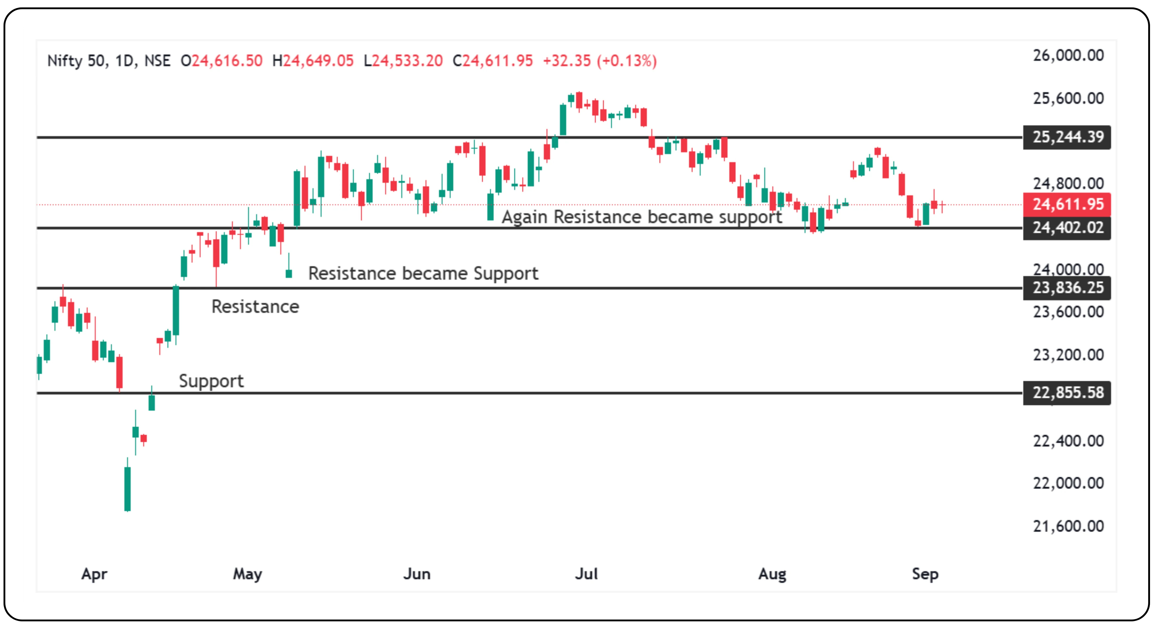
5. Support becomes resistance — market psychology in action
As seen in the chart, support and resistance levels often interchange roles during price gaps. Initially, the market found support at lower levels, but once resistance was broken, it acted as new support. Later, another resistance was broken and again turned into support, visible around the gap-up moves. These shifts highlight how buyers gain confidence after breakouts, while failed supports turn into selling zones. Recognizing these dynamics helps traders align with market sentiment.
Test your knowledge
Is this area acting as a support right now?
Think about how price behaves when it approaches a support level. Does it bounce off or break through?
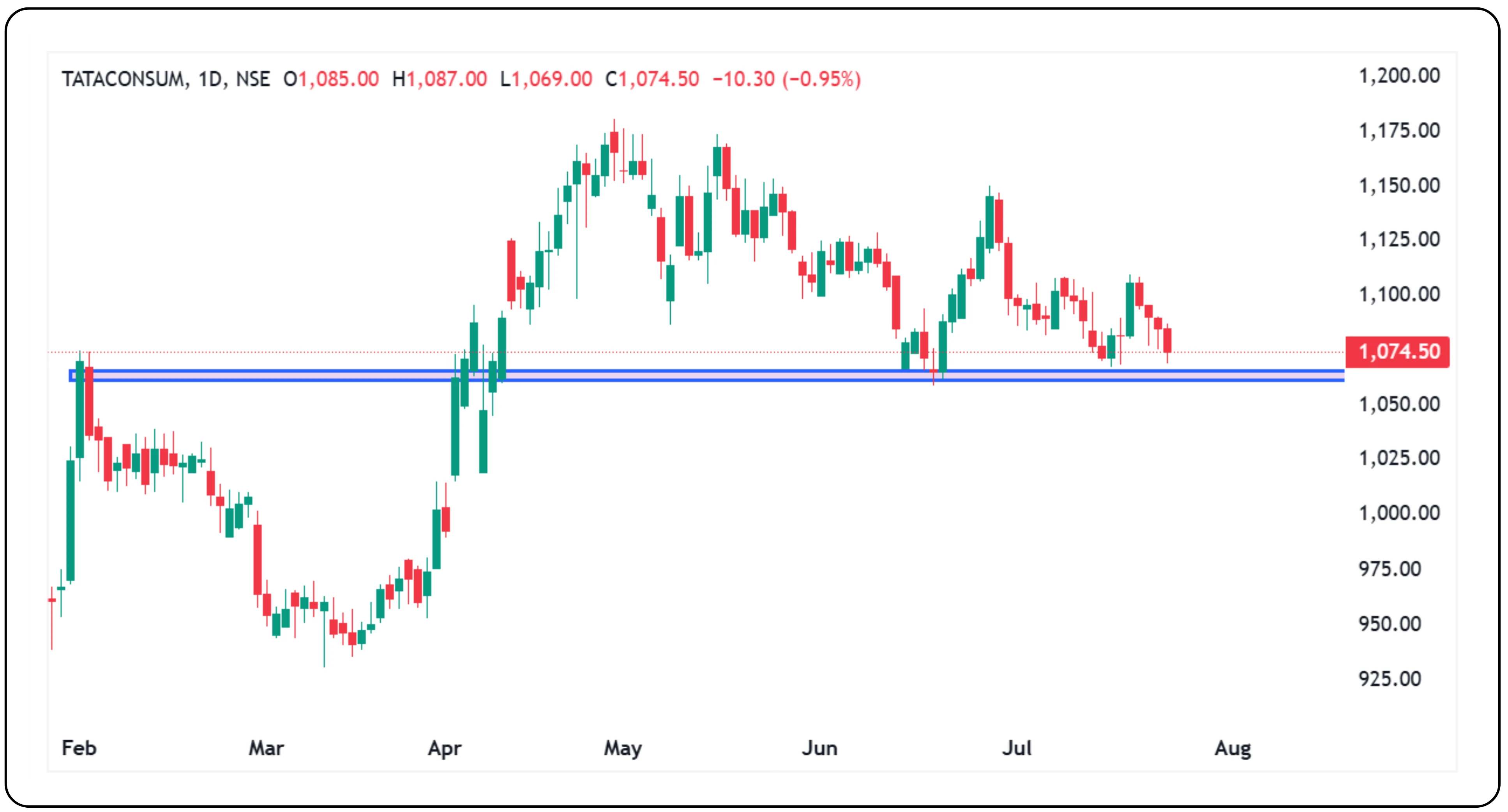
Chart speaks
The highlighted zone in the above image has acted as a support for Tata Consumer. After the breakout in April, the price retested the same zone multiple times. Each time, buyers stepped in to defend it, making this a reliable support level for now.
When market structure and signals work together
Whether you are a price action trader or just beginning to explore how price behaves on a chart, learning about support and resistance is a core part of your toolkit. Many traders use price action trading methods to study how prices move without relying heavily on indicators. They look for patterns like the inside bar candle or the pin bar to spot possible turning points or breakouts. These candlestick patterns become even more effective when used alongside support and resistance zones, as they help confirm whether the price is likely to hold or break through.
To strengthen this approach, indicators like the exponential moving average indicator also help, along with support and resistance trading zones, especially during strong trends in the stock market. The use of EMA in stock market is common for spotting momentum shifts and finding better entry levels. When prices break past key levels, traders often look for confirmation through breakout patterns before making a breakout trading decision.
One thing to remember
Support and resistance are not foolproof. Sometimes, price smashes through as if the barrier was never there. But often enough, they work because they reflect human emotions, like the fear of losing money, the hope of breaking even, or the crowd’s habit of acting at the same levels.
Next time you see prices move, look for these floors and ceilings. It might just help you decide when to get in or out before the crowd does.
Learn to spot support and resistance and use them as guides. They are not magic, but they are great tools to help you understand where prices could pause, bounce, or reverse. And remember, price patterns show us people’s feelings on a chart.
Ready to trade smarter? Explore the CubePlus trading terminal.
Disclaimer: The information provided in our blogs is for informational purposes only and should not be construed as financial, investment, or trading advice. Trading and investing in the securities market carries risk. Always conduct your own research and consult with a qualified financial advisor before making any investment decisions. Past performance is not indicative of future results. Copyrighted and original content for your trading and investing needs.
© 2025 — Tradejini. All Rights Reserved.